Emotions in Web Design: Bare Coaching's Bold Statement

Way-Too-Honest Business Coaching: A Study in Emotional UX
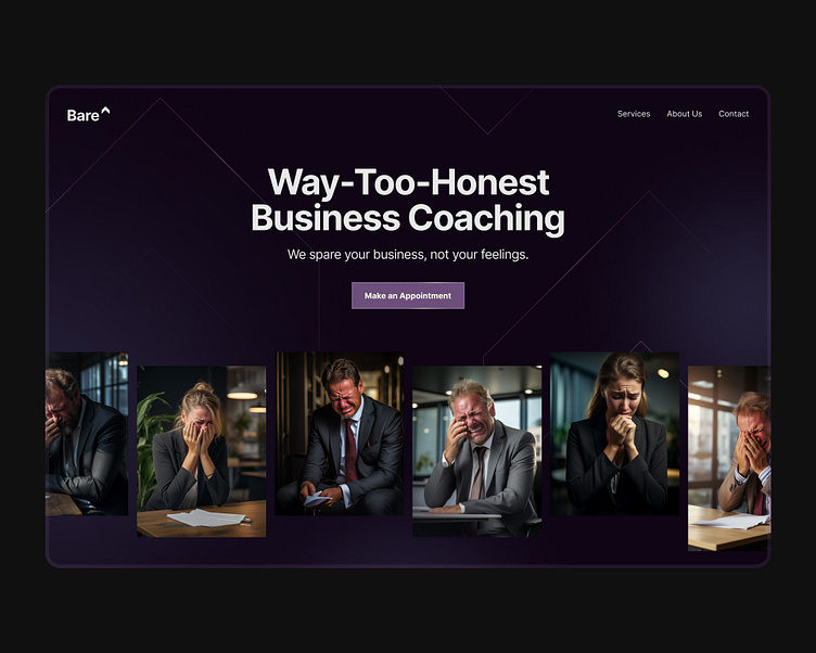
Unveiling our latest design exploration for Bare^, a business coaching service that promises a no-nonsense approach. This design capitalizes on the visceral reactions of clients to drive home the brand's unique value proposition: "We spare your business, not your feelings."
🔵 Color and Emotion: The deep purple hues set a serious, almost somber tone, reinforcing the brand's straightforward ethos. The color palette is not just a backdrop; it's a participant in the narrative, shaping the user's emotional journey.
🖼 Imagery that Speaks: Pain, laughter, relief - human emotions are front and center in this layout. The candid shots of people in distress convey honesty and evoke empathy, making the service's offer clear: raw, transformative business advice.
👁 Layout and Flow: The user's eye is guided through the emotional spectrum with a clean, balanced layout. Each image is framed within its own space, allowing for individual stories to be told, while collectively they form a cohesive narrative.
📝 Typography and Clarity: We've opted for bold, sans-serif fonts for headings to cut through the noise, with serif fonts for body text to add a touch of formality and seriousness. The contrast ensures readability and maintains a professional aura.
✨ Subtle Interactions: We integrated micro-interactions that respond to cursor movements, fostering engagement without overwhelming the core message. The 'Make an Appointment' button pulsates gently, inviting action without pressure.
💡 Takeaway: This design is a testament to the power of emotional design. By aligning the visual and emotional language, we've crafted a user experience that's not only memorable but also remarkably honest.
We are available for work: thomas@bousbous.be
Check out our website
Don't mind connecting on LinkedIn.
Follow me on twitter.


