UNESCO's Fit for Life Brand Identity

Role:
Brand Identity
Client:
UNESCO
Year:
2023
Objective:
As the Brand Designer for UNESCO's Fit for Life initiative, my goal was to collaborate with the UNESCO Sports section to develop a visual identity. This would be used to promote and implement Fit for Life, a global initiative advocating for smart investments in sports to enhance education, equality, and well-being. The focus also includes engaging civil society, especially youth, and highlighting their creativity in the process.
What I've Achieved:
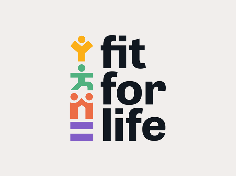
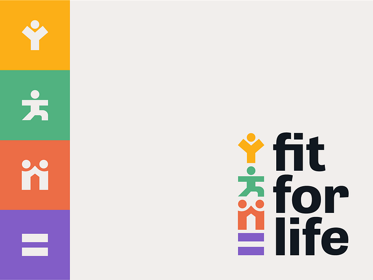
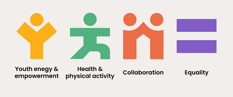
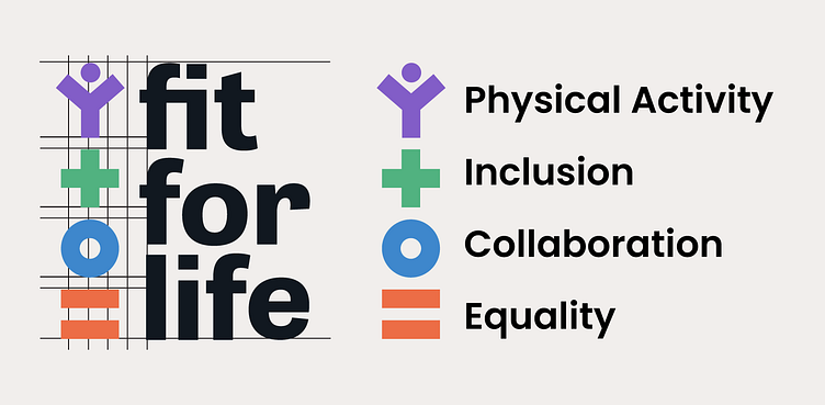
Created a logo that expressed the core values of Fit for Life: youth energy & empowerment, health & well-being, collaboration, teamwork and collective action, and equality & inclusion.
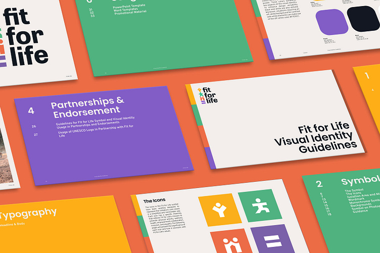
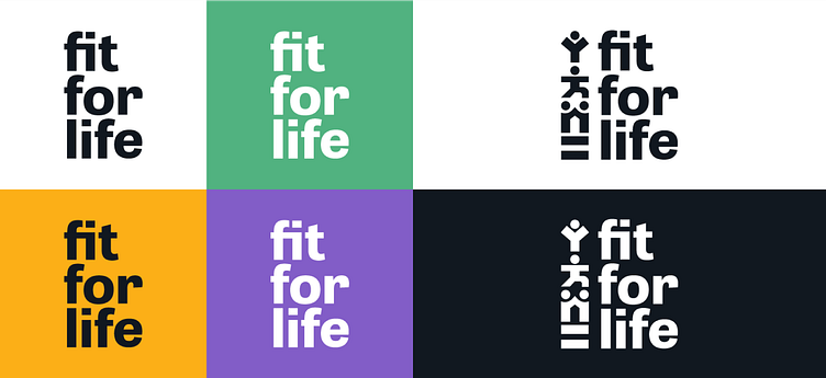
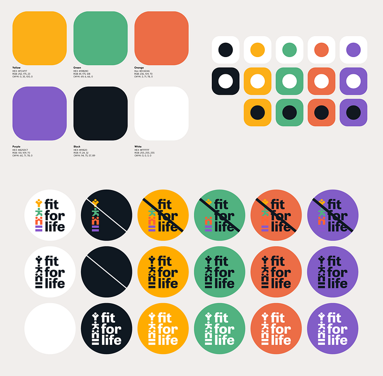
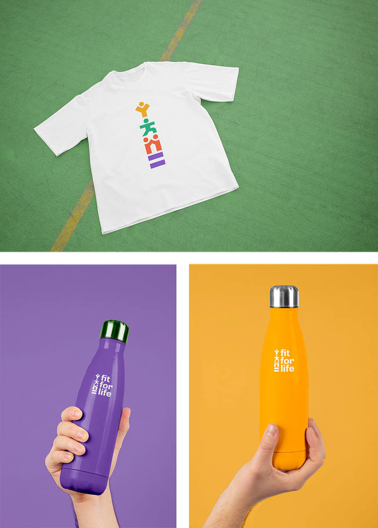
Developed a comprehensive visual identity system, including logo design, color palette, typography, and design elements, to establish a strong and recognizable brand presence for the Fit for Life Initiative.
Created visual identity guidelines to ensure consistent application of the visual identity across various materials and platforms.
Creative Process:
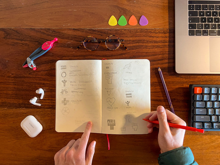
1. Research and Discovery: This process began as a visual identity contest for Fit for Life, launched by UNESCO. My first step was to immerse myself in everything I could learn about Fit for Life. What caught my attention the most and what they were looking for was to express their values, especially those related to health and physical activity, collaboration, inclusion, and equality.
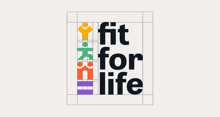
2. Concept Development and Symbolism: In this process, I aimed to develop a logo that looked good yet remained simple and reflected Fit for Life's values. Initially, the symbols I used in my winning proposal were simpler, but with the help of the Sports team, we refined everything to achieve the final result.
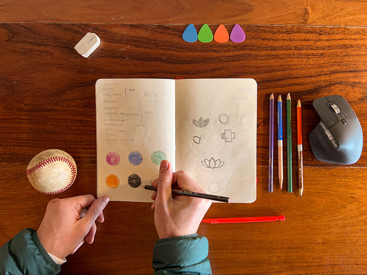
3. Colors: Next, I meticulously chose the colors. Originally, they were the same colors that ended up being used, except for blue, which was replaced by yellow to better reflect the youth spirit. Green was selected because it relates to diversity, health, well-being, and inclusion. Purple signifies empowerment, while orange represents sports, community, energy, and vitality. I also selected a shade of black that complemented the color palette and an off-white for when it was needed.
4. Logo Design: This process involved incorporating everything I had decided into a logo and making it look its best. I chose a wordmark and then ensured that the figures had the same thickness as the wordmark.
5. Typography: I selected a typeface that matched the wordmark and achieved a sober yet youthful look.
6. Refinement and Finalization: Finally, after winning the contest with my proposal, I worked closely with the sports team to enhance the design. The main corrections focused on achieving a sportier look and replacing blue with yellow to better reflect the youth spirit that Fit for Life aims to convey.This challenge came with the responsibility of preserving the meaning of the core values, but I believe that I was able to resolve it in a way that significantly improved it.
Results:
“This visual identity depicts active, inclusive and equal societies in an innovative way, which is what we want to achieve through the Fit for Life Alliance. We are excited to share our vision and objectives with our existing and future partners.”
Gabriela Ramos
Assistant Director-General for Social and Human Sciences of UNESCO.
We successfully created a visual identity that was simple and memorable while effectively conveying Fit for Life’s values through the logo and visual identity design. Furthermore, we developed visual identity guidelines that allow all users, including the UNESCO Secretariat and its networks (Chairs, schools, etc.), public authorities responsible for sport (ministries, local authorities, etc.), investors (businesses and development banks), sports rights holders such as sports organizations (federations, NOCs, clubs), media, and sponsors, Sport for Development and Peace organizations, as well as Fit for Life Champion countries and cities to use Fit for Life’s identity consistently and effectively.
By providing this tool to Fit for Life, we not only created a compelling and memorable visual identity but also empowered the initiative with a powerful means to be remembered and promoted effectively, engaging all these users in its mission and vision.
Conclusion:
Developing the visual identity for Fit for Life has been an incredibly gratifying and enriching experience. I am delighted that my work has made a significant impact on the world. Fit for Life is an initiative that deeply resonates with me, as I share the belief that positive societal changes can be achieved through sports.
I leave with a sense of fulfillment, knowing that we have successfully created a memorable visual identity that faithfully reflects the values and goals for which Fit for Life tirelessly strives. I am proud to have contributed to this cause and to have been a part of a project that promotes education, equality, well-being, and collaboration through sports.


