The Wave wines by the Labelmaker

Crafting the Wave: A Designer’s Journey into the Black Sea terroir
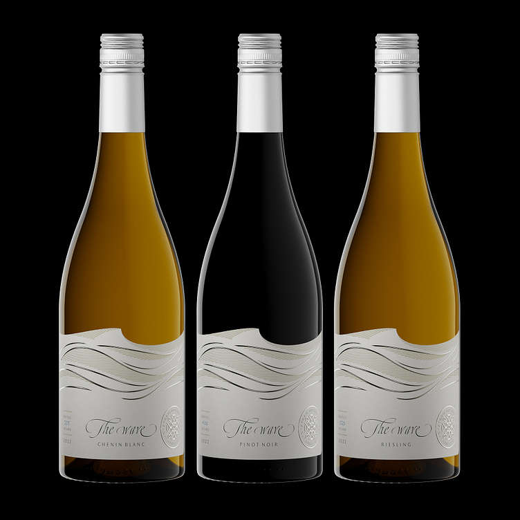
As a designer, I’m always in search of that perfect blend of modernity and timeless appeal, the sweet spot where artistry and innovation meet. Crafting the label for “The Wave” wine range by Chateau Boshnakoff was a journey that led me to the shores of the Black Sea, near Varna Lake, where the waves and the wines shared a unique story.
The cornerstone of this label is the majestic wave – a symbol of strength, beauty, and the ever-flowing essence of the sea. To do justice to this remarkable region and its terroir, we needed a label that would evoke the same emotions that a glass of Chateau Bosnakoff wine inspires.
The wave on this label isn’t just an image – I wanted to go beyond mere aesthetics, to create an artwork that you could feel, quite literally. To achieve this, I used linear debossed patterns, adding depth and texture to the label. When you run your fingers over the label, you can sense the gentle ridges, making the label an embodiment of touchable elegance. I then brought in artistic, wavy curves, stamped with hot foil and embossing. These curves not only complemented the linear patterns but added an element of playfulness to the design, creating a stunning 3D effect when the light dances across the waves.
The choice of paper was crucial to complete the sensory experience. I opted for solid, thick paper with a smooth texture. This tactile quality adds to the overall elegance of the label, ensuring that it exudes quality and sophistication, just like the wine inside.
To enhance the label’s visual identity, I designed a custom shape, culminating with a wave-shaped top edge. This artistic choice was more than just an aesthetic one; it was a statement, a nod to the profound inspiration drawn from the sea itself.
At the bottom right corner, I carefully placed the Chateau Boshnakoff winery logo. I wanted this symbol to be more than just an emblem; it had to be a testament to the winery’s unwavering commitment to excellence. My friends from Dagaprint stamped it precisely with silver foil and strong embossing, ensuring that it’s a mark of quality and distinction.
“The Wave” brand name was actually our way of tying the wines back to their origins in the Black Sea terroir. Just like a new wave crashing onto the shore, these wines signify a fresh approach to winemaking, a new perspective, and a unique experience that the Black Sea region offers.
Crafting “The Wave” label was a journey of creativity and artistry, where every detail was painstakingly considered. It was an ode to the Black Sea, Varna’s rich history, and the innovation that Chateau Boshnakoff brings to the world of wine.
This label isn’t just a piece of art; it’s a reflection of the dedication, the craftsmanship, and the creativity that go into every bottle. It’s a visual and tactile experience that encapsulates the beauty and essence of the Black Sea wine region, promising a journey of elegance, innovation, and timeless flavor.
So, next time you hold a bottle of The Wave, remember that it’s not just about the wine inside; it’s about the waves of creativity and craftsmanship that brought it to you. It’s about the artistry and passion behind the label, a journey that took us to the heart of the Black Sea, right into your hands.


