Agencija CC Logo Development

Client: Agencija CC
Services: Redesign Brand identity
Year: 2023
Design: Sanjin Halilovic
About Client:
The Agency CC Ltd. was established back in 1999 as a small family business, focused on accounting services. It was founded by the married couple Aida and Elmedin Ćatović. Over the years, the agency has grown, and today, 15+ years since its founding, together with 6 other employees, they perform a wide range of accounting and financial tasks.
Our relationship with clients and the trust we nurture among ourselves, we see as our greatest strength.
The Concept:
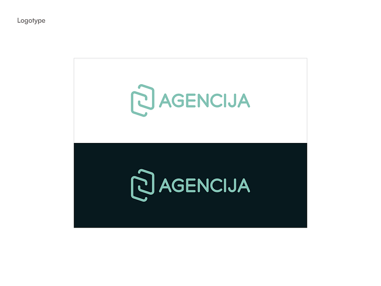
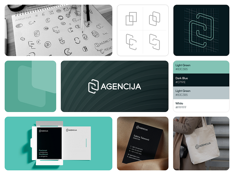
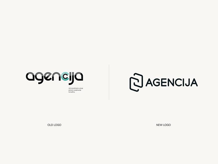
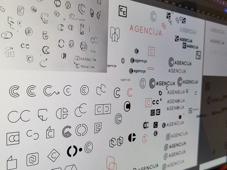
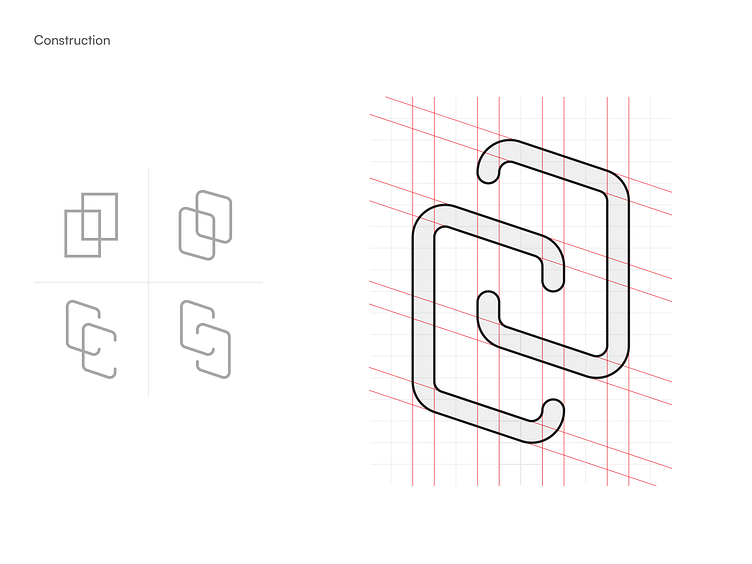
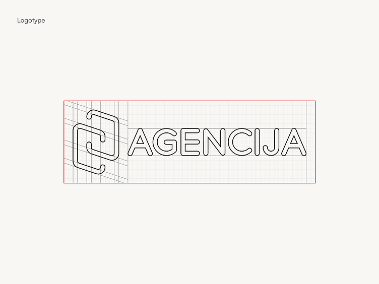
The main elements of the logo are two letters "C" shaped to resemble stylized pieces of paper leaning against each other. This design is not only visually appealing but also deeply symbolic. Papers are a classic symbol of accounting and finance, reflecting the agency's core business. Their overlapping signifies careful analysis and the integrity the agency offers to its clients. The curved edges of the papers add a touch of elegance and fluidity, suggesting that accounting is much more than dry numbers.
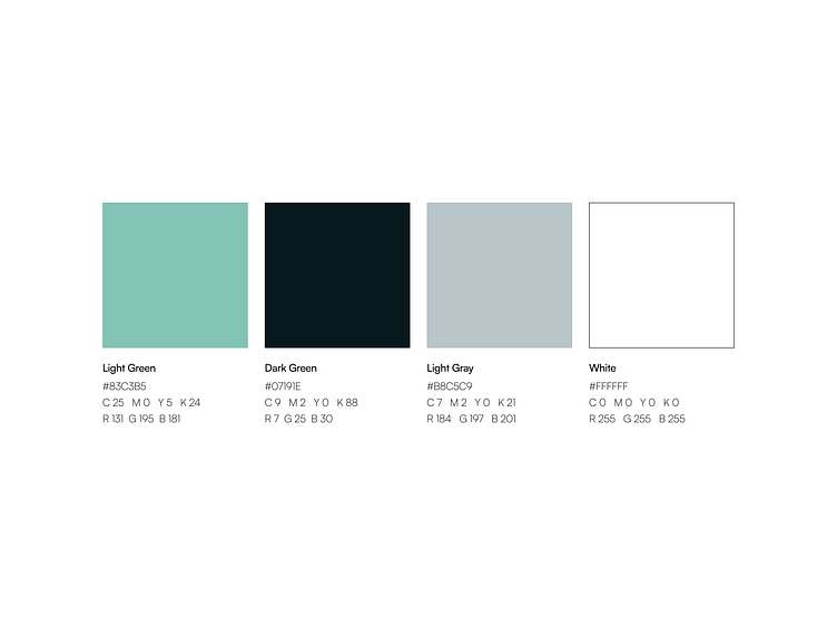
When it comes to colors, the suggestion is to use shades of green. Dark green signifies seriousness and reliability, while light green gives a sense of freshness and innovation. These colors will add a serious tone to the logo, making it visually pleasing at the same time.