Pluto brand evolution

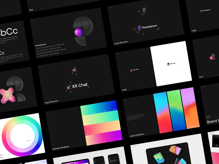
New typeface and colors while keeping the iconic spatial P-shaped icon.
Our goal was to align the brand with the company's recent transformation going from an experimental tech start-up to a trustworthy product company. Read the case study.


