Tech Company Logo Design


Concept details:
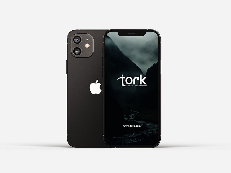
"The Tork Inc." is a powerful representation of the concept of "Torque" and its profound connection to your mission of driving your clients' success and growth. The logo showcases a captivating wordmark, emphasizing bold and clean typography. It's a Wordmark-type logo with a unique twist.
The design ingeniously combines the letters 'T' and 'R.' The upper part of the letter 'T' gracefully curves, forming an angular symbol reminiscent of torque and precision engineering. The 'T' itself is stylized like the Greek small letter tau (τ), further emphasizing the concept.
The upper right part of the letter 'R' transforms into an arrow sign, symbolizing progress and forward momentum. This represents our commitment to propelling our clients toward success through innovative software solutions.
The logo features a striking color scheme with an angle gradient, blending light purple and blue hues inspired by your previous logo. These colors evoke creativity, trust, and reliability.
The choice of a sans-serif font adds a modern and clean touch to the logo, aligning with our dynamic approach to software development.
In summary, "The Tork" logo embodies the essence of torque, innovation, and driving success. It's a visual testament to your dedication to pushing boundaries and delivering creative solutions that power the growth of your diverse clientele, spanning various industries.
This is an unused Logo Concept. If you need this one.
Say Hello - abvectart@gmail.com
Full project view - Behance
Reach out to me on social media-
WhatsApp: https://wa.me/+8801728157278
Facebook | Instagram | LinkedIn | Twitter | Skype |
Telegram - @abvectart | Discord - #7208


