Airship Coffee Rebrand


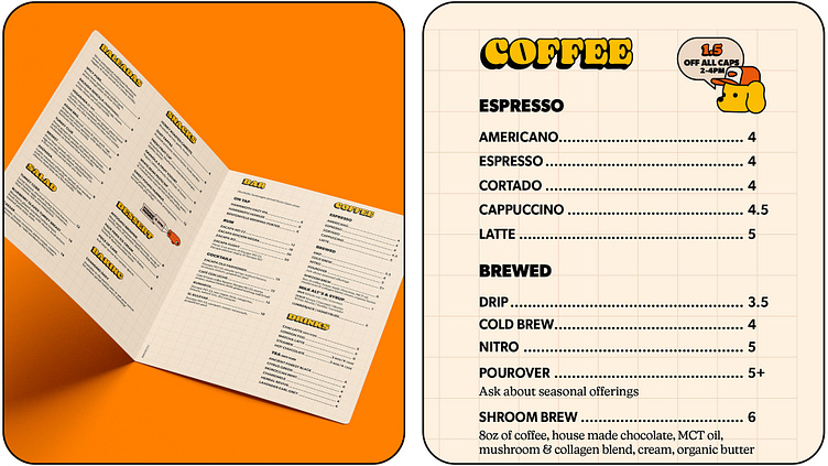


Airship Coffee, located in Bentonville, Arkansas, is not your typical coffee roaster. With four unique cafes, they approached me to breathe new life into their existing brand. Their only stipulation was that the redesign should be playful and illustration-driven. Interestingly, they approached me primarily for my illustration skills, unaware of my background as a graphic designer with experience in brand development. They needed a comprehensive brand package, including guidelines, packaging designs, and templates for labels and menus.
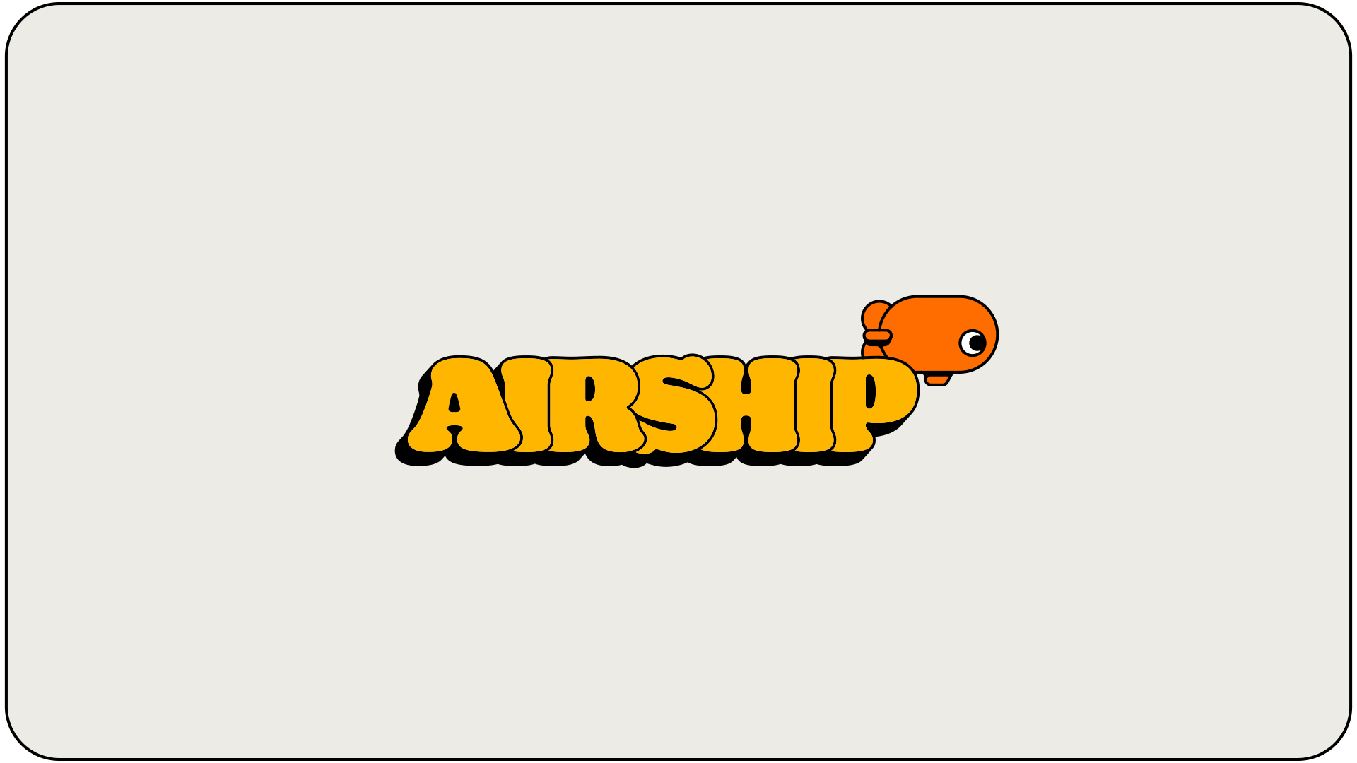
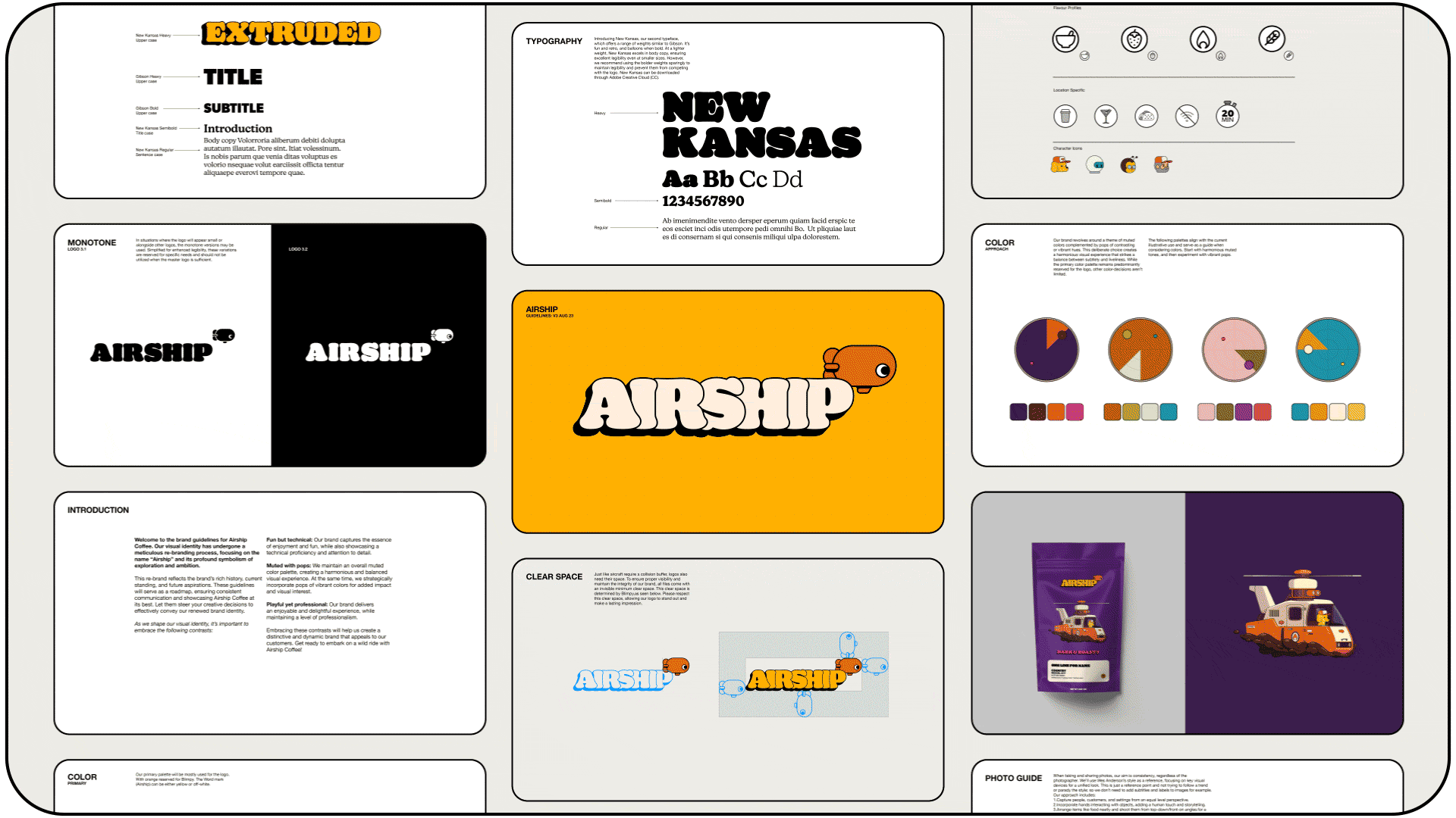
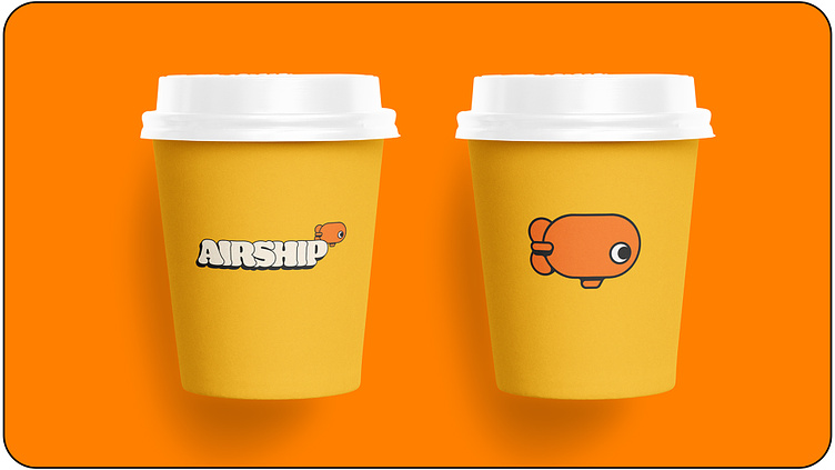
My journey began with revamping their logo, which had been a literal blimp graphic.I was inspired by retro toy logos and used 'toys' as the foundation for creating an illustration-centric brand. Design-wise, I wanted to keep things simple so not to compete with illustrated elements. I employed a primary color palette consisting of three colors and opted for an inflated-looking serif typeface, New Kansas, to carry the brand. To complement it, I paired Gibson, a bold and straightforward sans-serif typeface. I also incorporated iconography to highlight flavour profiles and showcase the unique offerings at each of their locations.
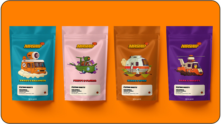
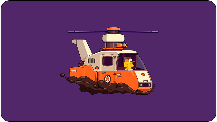
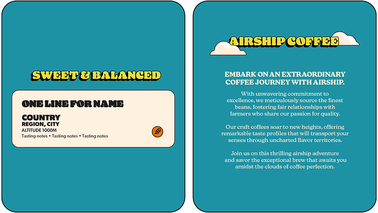
In the case of packaging, which previously consisted of a plain paper pouch featuring only the logo and text label, I aimed to craft a narrative around the name 'Airship'. Airship roasts coffee to four distinct flavour profiles: Sweet & Balanced, Fruity & Floral, Herbs & Spice, and Dark & Roasty. Additionally, each location boasts its own distinct character, including a café nestled in the woods and a converted water pumphouse. These unique elements served as the inspiration for four quirky ship designs and characters. As the brand continues to evolve, these characters may even become mascots for each location, as well as injecting personality and flavor into the brand's online presence.
Here's my portfolio and feel free to follow me on insta: @emiletheillustrator