ERP System Dashboard Design

Hello everyone,
I'm excited to present my latest UX/UI design project, the Enterprise Resource Planning (ERP) System Control Panel.
Project Overview
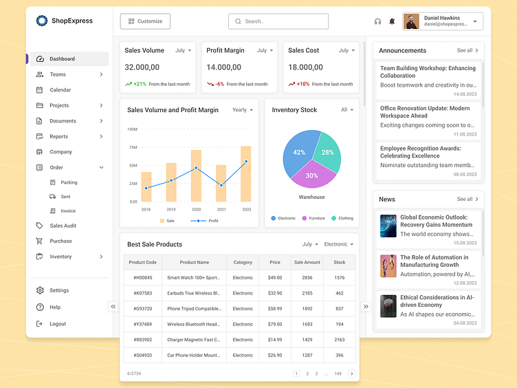
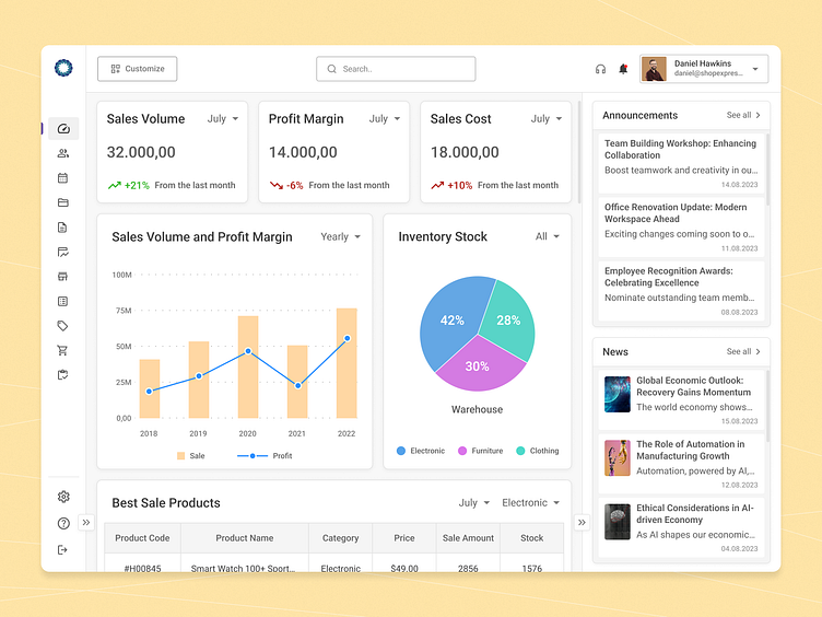
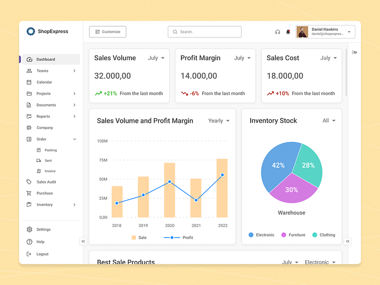
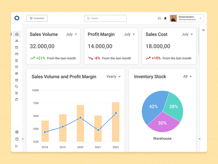
In today's fast-paced business world, effective management of corporate operations and resources is vital. With this in mind, I've designed a dashboard that provides a visual breakdown of corporate resource data and instant access to information from various departments, and crucial metrics that require real-time monitoring. The dashboard I've created allows users to effortlessly access the data they need, conduct more consistent analyses, and gain a competitive edge by expediting decision-making within the workflow.
🎨 Design Concept: In this project, I've crafted a design that offers users an easy and elegant way to explore data.
🔍 Enhanced Data Viewing: To enhance the dashboard's usability, I've introduced options to hide side panels, providing more room for the main panel graphs and tables.
🧩 Customization: Empowering users is paramount. That's why I've incorporated a customization feature on the main panel, enabling users to add or remove graphs and tables based on their priorities.
Outcome
This dashboard aims to streamline business operations, enhance the user experience, and equip businesses with actionable insights.
Users can effortlessly tailor their view and interact with data that are precisely tailored to their unique requirements, all thanks to the clean and uncluttered interface.
📝 I'm continually seeking ways to learn and improve. If you have any feedback or suggestions, please don't hesitate to reach out to me.


