Raynmakers - Responsive website design for a management tool


Mobile era
In an era where mobile traffic accounts for over 50% of web visits, businesses can't afford to overlook the critical need for a responsive website, ensuring seamless user experiences across all devices.
Raynmakers is no exception. We've applied the same client-centric principles for the responsive version, ensuring maximum comfort and ease of use.
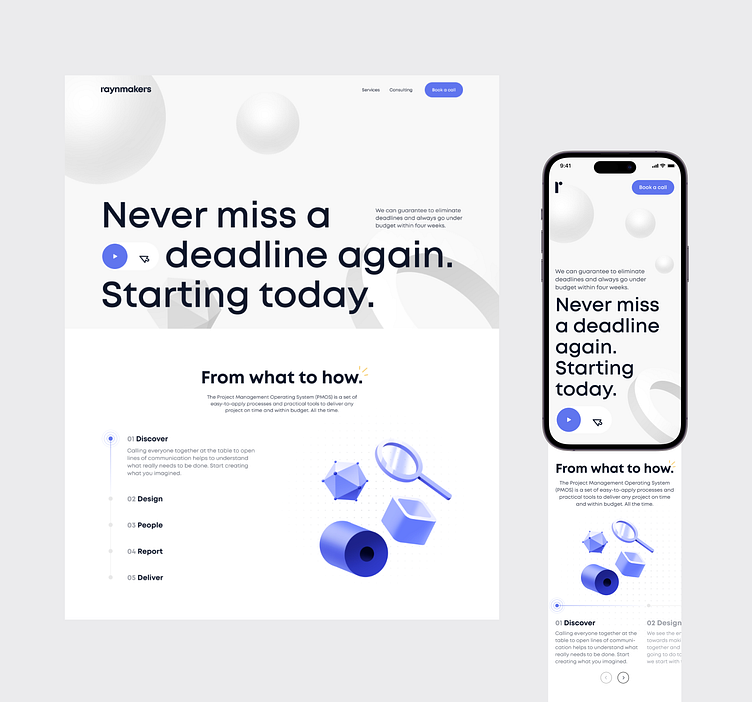
Navigation is simplified, and elements are thoughtfully arranged to make exploring information and using the site a breeze. Whether you're on a phone or tablet, it's all about convenience.
The result? Optimal interaction with our users. Now, you can access information effortlessly, no matter where you are.
Our commitment is to deliver a consistent, high-quality experience, regardless of your device.