Find designers
Designer search
Quickly find your next designer
Post a job
The #1 job board for design talent
Inspiration
Courses
UX Diploma
Learn UX design from scratch in 6 months
UI Certificate
12-week UI skill building for designers
Live interactive workshops
with design professionals
Jobs
Go Pro
Log in
Dribbble: the community for graphic design
Log in
Sign up
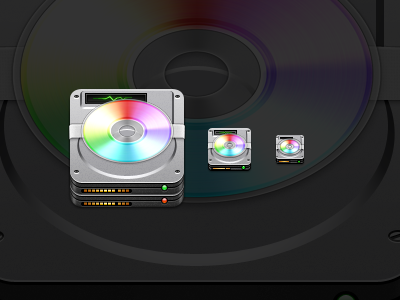
Disk Doctor
Rickie Sherman
Available for work
Follow
Following
Like
Get in touch
#242424
#575858
#A8A8AA
#E2E2E4
#41511B
#C28065
#66DBDB
Download color palette
Tell me what you think please, It would be greatly appreciated!
2011
icon
mac os x
View all tags
Posted on Aug 2, 2011
6,679
9
117
13
View feedback
Rickie Sherman
Get in touch
More by Rickie Sherman
View profile
Previous
Next
Loading…
Loading…
Loading…