Puffy Redesign

Simplifying the Home Page:
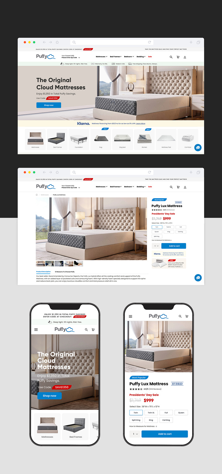
To create a more focused and less distracting home page, I have reduced the height of the banner and used static slides instead of a video background. This will allow users to focus more on the main content and product categories, leading to a better user experience.
Using Accent Colors:
To create a user experience that is calming and relaxing, I have used accent colors for other strips on the page. These colors are specifically chosen to match the feeling of a relaxing home environment, and will help users feel more comfortable when shopping for a mattress or bedroom accessories. The high contrast colors are used for sale tags to grab users’ attention, making them stand out from the rest of the page.
Introducing Modal Store Locator
To reflect our company’s recent focus on omnichannel shopping, I have introduced a modal store locator using pin code. This feature will help users find the nearest relevant store without leaving the page, which is especially important for users who prefer to shop in-store. This feature will also help the company drive more foot traffic to their physical stores.
Introducing Search Bar
Incorporating a search bar can help identify user pain points and areas for improvement. By analyzing user search data, UI/UX teams can gain insights into what users are searching for, which can inform future design decisions. User search data can be leveraged when designing for smart devices such as smartwatches and voice assistants like Alexa. By analyzing search data, UI/UX teams can gain insights
Visual Product Cards with Tags:
To better showcase our products and introduce new launches to our users, I have introduced visual product cards featuring our company’s products above the fold. I have also used tags to highlight new launches, so that newly launched products are introduced to all users, irrespective of the product they came looking for.