MotherDuck

Branding
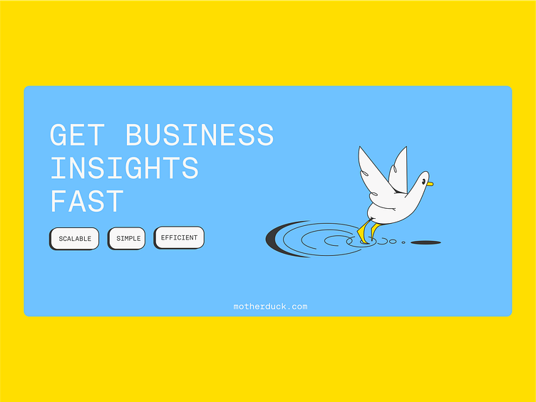
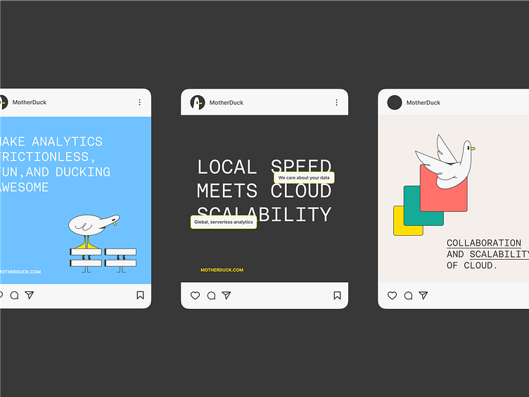
MotherDuck wants to change the way people think about data analysis–with their cloud-based data analytics platform, getting key business insights can even be fast, frictionless, and, dare I say... fun!
But that doesn’t mean professionalism gets thrown out the window. The branding we created for MotherDuck combines playfulness and energy with a clean, cohesive look that generates confidence in users who entrust their data with MotherDuck.
Illustrations
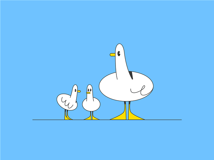
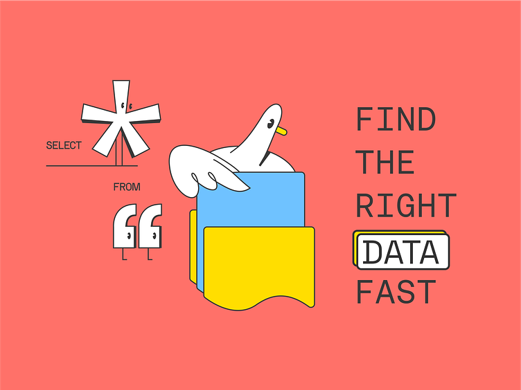
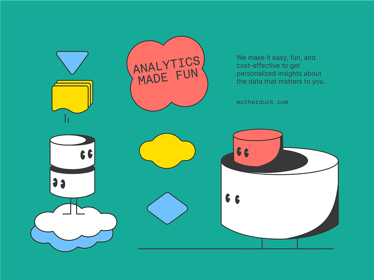
Our focus with MotherDuck’s illustrations was to express the sense of playfulness and quirkiness that is so important to their brand.
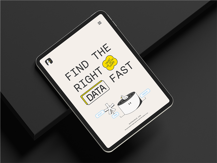
We revamped the brand’s signature duck character and created compositions that interact with different SQL symbols and complete simple programming tasks. For example, the duck can easily find data in a folder or data “ponds,” showing how efficient these tasks are when using MotherDuck.
This bold, graphic imagery comes together to give users the sense that they will have a simple, fun experience using the product.