


Hathora

Branding
Hathora’s cloud-based solution for multiplayer games was destined to make a splash in the gaming world. All that was missing was a sophisticated, tech-focused brand and website to back them up and build trust in potential users and investors.
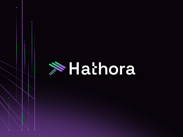
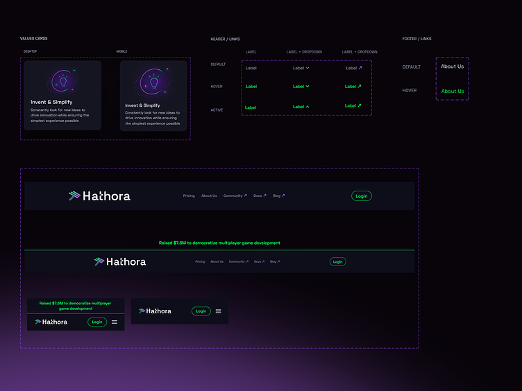
Hathora's new brand features a revamped logo, a modern, dark mode color palette, typography reminiscent of code, and custom, animated illustrations that represent infrastructure in the gaming world.
Website UX/UI
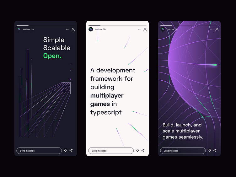
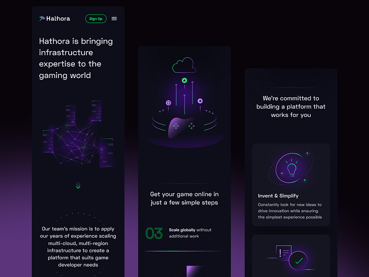
Hathora’s goal is to make life easier for game developers by providing seamless, cloud-based infrastructure. Just like the product itself, the site was built with developers in mind, designed to showcase how it will streamline their game-building.
To do so, we focused on creating an intuitive, user-friendly interface throughout the site and included visuals that represent Hathora’s functionalities and benefits.
Upon launch, Hathora was able to secure $7.6m in seed funding!
Illustrations
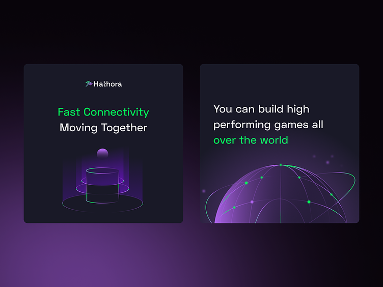
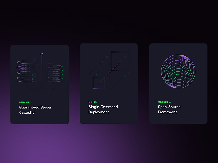
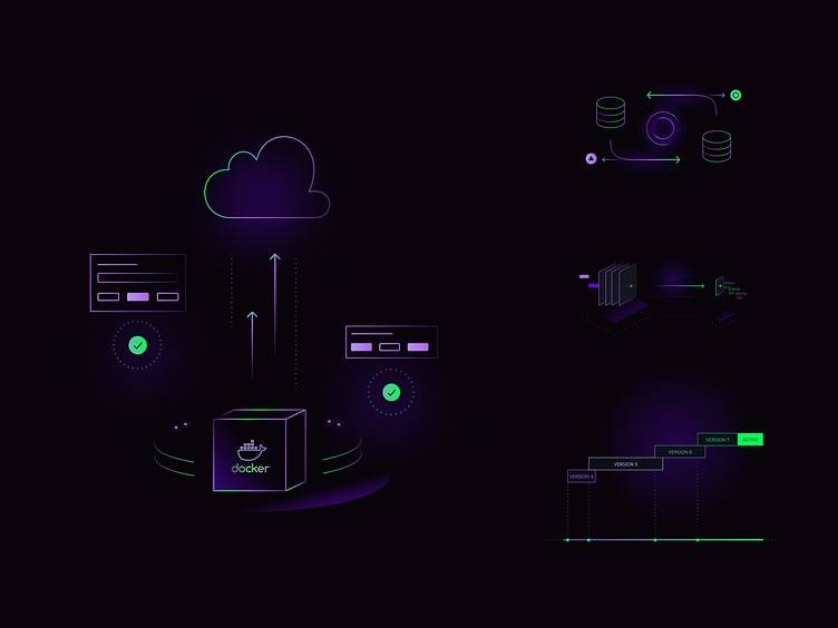
We created futuristic, animated illustrations to accompany Hathora’s website and all their branded materials. The illustrations are made up predominantly of connected lines with color gradients running through them–a representation of infrastructure, agile data exchange, and global connection when playing multiplayer games.
Our goal with these illustrations was to strike a balance between abstract concepts and the actual infrastructure that keeps cloud-based games up and running, supporting Hathora’s value proposition.
Credits
Maximiliano Malisani (Art Direction)
Josefina Nino (Design)
Mila Gutierrez (Design)
Florencia Daniele (Design)
Nicolas Baumgartner (Motion Graphics)
Lucia Perez (Illustration)


