Speaktacular – Branding & UI Design

The Speaktacular project is one of my fauvorite projects. Working on this was a unique and rewarding experience for me, as I was responsible for co-creating the platform's flow and designing the branding and communication materials.
The platform aimed to provide an anonymous and positive space for women to connect and share their experiences without judgement.
My role involved designing the logotype and key visual, as well as preparing layouts related to writing posts on the platform, including post listing, creating a new post, and viewing a single thread.
Listen to others
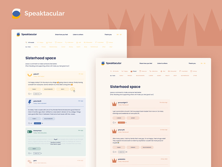
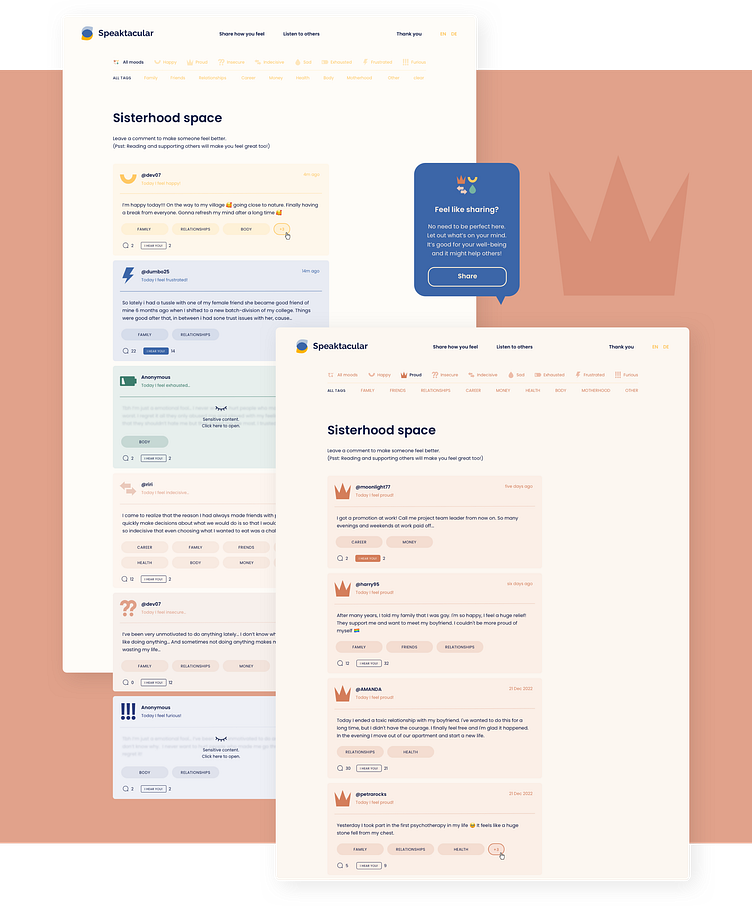
The post listing on Speaktacular is a powerful tool for women to connect with each other and find support. The posts are categorized by the mood chosen by the user, allowing others to easily find and relate to posts that reflect their own emotions. In addition, tags can be added to further categorize the posts based on relevant topics. This makes it easy for users to find posts related to their interests or concerns.
However, some posts are blurred as a trigger warning if the content is sensitive. This is an important feature that helps to protect the emotional well-being of users, while still allowing them to connect with others who may have similar experiences.
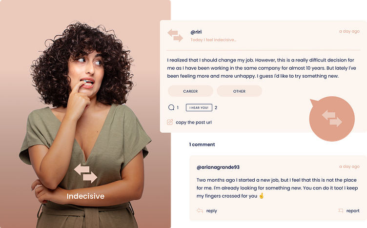
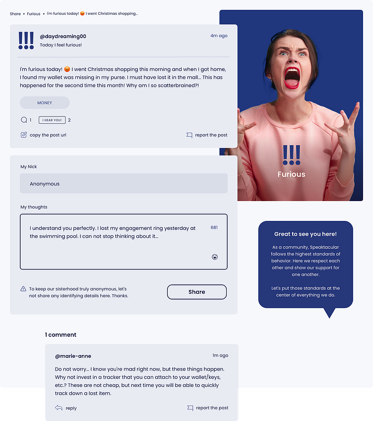
Single thread
The single thread feature on Speaktacular allows users to engage in meaningful conversations and show support for one another. Users can react to a post by clicking the "I hear you!" button, which serves as a virtual hug and a way to express empathy. This feature helps to create a positive and uplifting environment where women can connect with each other and feel heard.
Users can also comment on a post to provide feedback, offer support, or share their own experiences. This creates a sense of community and allows users to build relationships with others who are going through similar challenges.
Branding
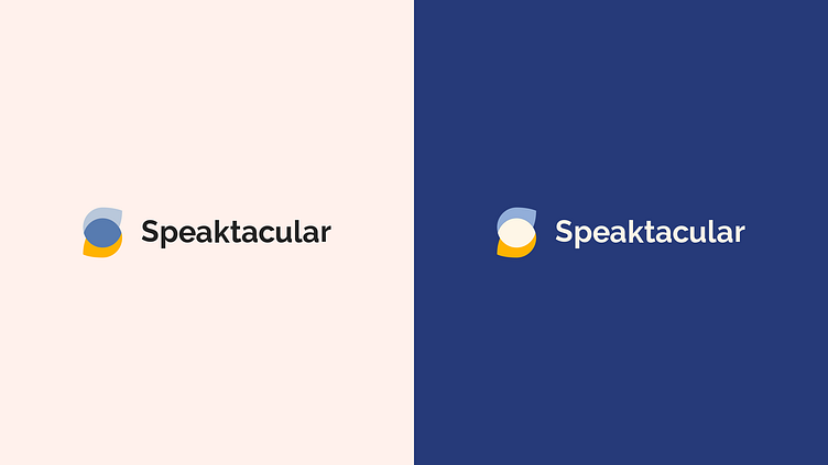
The Speaktacular branding has been carefully crafted to convey a sense of warmth, friendliness, and support.
The final logotype is a simple yet effective representation of the platform's brand identity. The emblem in the logotype depicts the connection of various colors, which represent different moods, and the letter "s". The logotype also refers to the simple icons used throughout the UI design, further reinforcing the consistent and cohesive branding of Speaktacular.
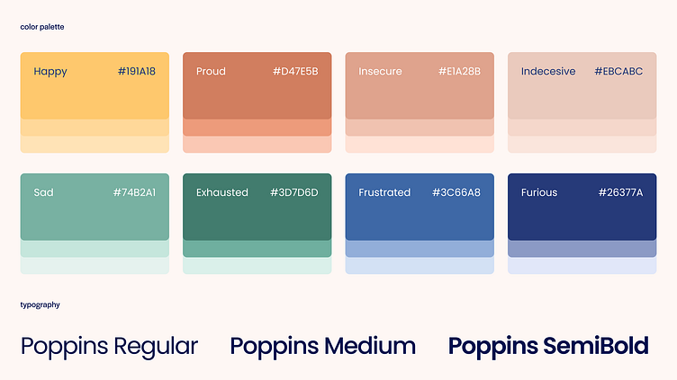
Colors and typography
The color palette used in the Speaktacular project has been thoughtfully designed to reflect the platform's values and to enhance the user experience. The shades of yellow, blue, green, and brown are warm and inviting, creating a friendly and approachable atmosphere.
Each mood on the platform has been assigned a specific color, making it easy for users to identify and navigate posts that are relevant to their current emotional state.
The project also features the Poppins font, which complements the friendly and approachable tone of the platform. Poppins is a modern and clean font that is highly legible and easy to read.