Duke_of_si_cu

Times and Teams

Shot_1275344033

5 Responses

  1. Pro Duke_of_si_cu Si Jobling

    World Cup KickOff is finally taking some shape, nearing completion for launch this week.

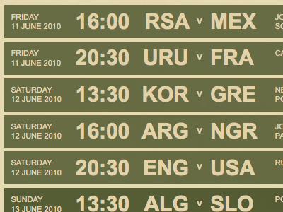
    I've been keen to avoid the typical clichés of trending design principles, especially with the heavy use of drop-shadows and bevels evident lately. I've opted for simple clean typography with plenty whitespace to separate the elements of each fixture.

    over 1 year ago

  2. Stu Stuart Frisby

    I'm quite excited. It's looking sweet. It has a bit of a subbuteo/mexico '86 vibe going on. Love the colours. Can't wait to see it go live.

    over 1 year ago

  3. Pro Alo_2_square Anthony Casey

    Yeah I like that. Like Stuart said it's got a nice old school vibe about it.

    Possibly would be nice with a flash of muted colour for each nation... but that could ruin the overall look.

    over 1 year ago

  4. Pro Avatar 2011 Paul Lloyd

    Looks promising! It sort of harks back to the old fashioned scoreboards, such as those used during the 1966 World Cup. I can't wait to see the rest of the site.

    over 1 year ago

  5. Pro Me Anthony Killeen

    That looks great Si, the muted simpleness of the 'scoreboard' is a fresh breath, and I'm glad you've avoided the typical trends.

    Nice work & looking forward to seeing the finishes work!

    over 1 year ago

keyboard shortcuts: previous shot next shot L or F like