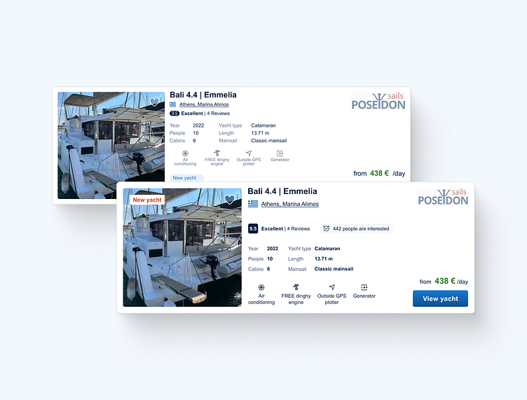
UI design principles - Product card (Boataround)

Hello Dribbble designers!
I would like to share with you my C.A.S.H. method that we're going to apply to the current design (January 2024) of the Product card from the website www.boataround.com.
The aim of this method is to take the original design to the next level and learn from it together. I hope you'll find it useful!
To speed up this process and then modify the current design, I used the GoFullPage plugin in browser and the html.to.design plugin from the Figma community.
With this method, I want to help you level up your UI design skills. Let's go!
The C.A.S.H. method:
When I'm designing, I follow the method that I call the C.A.S.H. method. This acronym stands for Contrast, Alignment, Spacing, and Hierarchy (it doesn't have to be in this order, but the name is catchy, am I right?). These are UI design principles that should serve as a solid foundation for designing effective and user-friendly product cards. Remember to adapt them based on your specific product, target audience, and design goals.
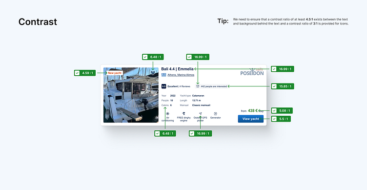
Contrast:
Making interfaces more readable and accessible by ensuring that a contrast ratio of at least 4.5:1 exists between the text and background behind the text and that a contrast ratio of 3:1 is provided for icons.
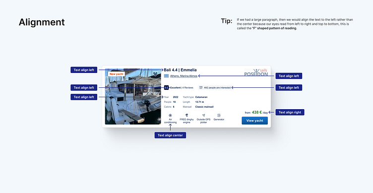
Alignment:
Users naturally expect elements to be organized. Precise alignment not only helps users with the efficient scanning of content but also ensures that users can navigate interfaces with ease.
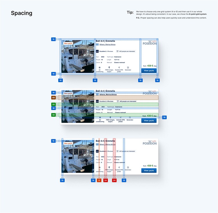
Spacing:
Thoughtful and consistent spacing between elements improves readability and reduces the risk of user errors. Adequate white space helps prevent visual clutter, allowing users to focus on essential elements without distraction.
Hierarchy:
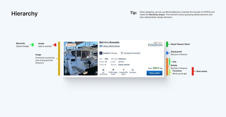
By establishing a clear visual hierarchy, we guide users through a seamless flow of information, helping them understand content priorities. Also we ensure that users can easily navigate interfaces, complete tasks, and access vital information without unnecessary friction.
We will use hierarchy stripes to make better design decisions. What do these stripes even mean? Grouping related elements. You will see them in this dribbble shot later on.
What we did:
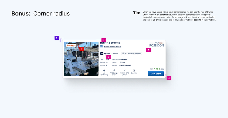
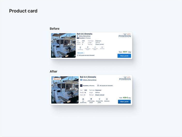
to improve the real look of the corner radius of the product card (4px) with an image (4px), we changed the corner radius of the product card to 8px,
to improve the contrast of the heart icon, we used the primary color blue with 70% opacity as the fill color of this icon,
to be consistent, we changed the distance of the heart icon from the top and right corner to 16px (originally 14px from top and 13px from right),
to improve the contrast of the special badge and inform all users more about the fact that some yachts and boats are new, we changed the color of the special badge with the label “New yacht” from light blue to orange (one of the company's main colors) and also we changed the position on the card of this badge to grab more attention,
to improve legibility, we changed the minimum font size from 10px to 12px,
to be consistent, we used dark blue color with 70% opacity for lighter text,
to improve readability and hierarchy, we used the 8-point grid system and divided content into related groups,
to be trendy, we used a gradient for the CTA button to imitate a 3D look because the era of the flat design is over.
In summary, Contrast, Alignment, Spacing, and Hierarchy are fundamental UI design principles, collectively contributing to the creation of interfaces that are not only aesthetically pleasing but also usable. Balancing these elements effectively enhances the overall user experience, making products more accessible, intuitive, and enjoyable for users.
Feel free to leave your feedback! And if you like my work, please press "L".
Thank you!


