Brand Identity (logo) for clothing brand by Elena Zavialova

Brand concept.
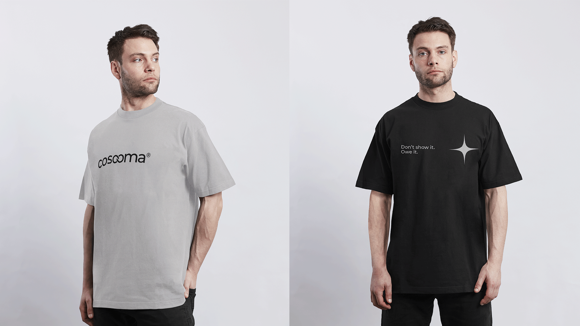
Cosooma is a sacred clothing brand from Portugal, connecting like-minded people, people striving for growth and development, and at the same time, each of them is a separate unit with its own individuality and originality. These are people of action, creators, thinkers, entrepreneurs.
Brand values: aesthetic philosophy, freedom, meanings, unity, honesty, simplicity.
Logo and mark.
The logo is based on two ideal connected circles, because the circle in sacred geometry is a symbol of infinity, perfection. Also in sacred geometry, two circles are the symbol of beginning of creation.
Brand color.
Orange color. The color of sunset, productivity, youth and energy. The color of cheerful and active people, dreamers with developed intuition.
Black is noble, calm, the color of luxury and self-confidence.
Gray is the color of security, sincerity and trust.
Font Montserrat is a geometric grotesque with an open character and slightly expanded proportions. Neat, minimalistic, modern. In styles ranging from bold in headings to regular in large doses of text. One of the advantages of Montserrat is that it is easy to read even when it is small.
Design solution.
I have created an image of a strong brand that will feel confident in the market among competitors.
Neatness, modernity and focus on premium. The brand looks like it can be sold at a high price. It is understandable, but at the same time with a mystery that you want to know. Agree, you want to ask. Why such a pattern, and what is written in small print? Thus, the customer draws attention to himself and his total look. And the brand is its living advertisement.


