NFT Marketplace Case Study (Dribble UI 101 Design Course)

Moodboard 1

Moodboard 2

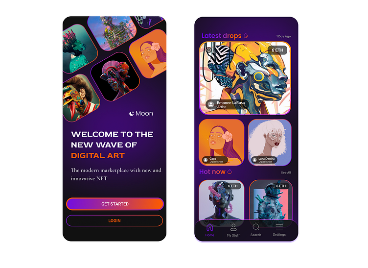
Concept V1
For this concept, which became the final direction, I focused on a darker mood with pops of color to standout against the background.
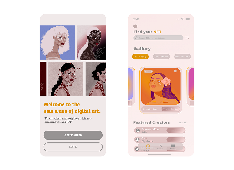
Concept V2
I decided to move away from this concept due to feedback I had gotten from my colleagues. The design is brighter overall, and I played with two different colors for the background. Ultimately, I felt like the design in V1 matched my vision of the brief better.
UI Library
Below are the typography styles and color scheme used throughout. I wanted the design to lean dark, while still having some colorful, almost neon elements to it. I chose a saturated purple and orange to act as my main pops of color. As my secondary colors, I used a basic gray and white along with a variation of the main purple and a pink that I felt was complementary to it.

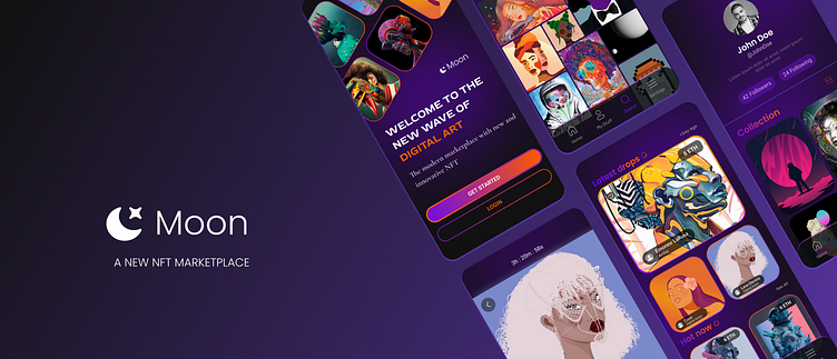
Final Screens
By doing this case study, I learned about how to scale a design from an idea into a usable prototype. It was really interesting to see how the slightest changes could give your design an entirely different vibe. The most challenging part in my design process was learning to scale the design and keep consistency throughout the different screens, not only with color scheme, but also with typography. This case study was a great introduction into going from a concept to a finished design.


