Portfolio Web Design Exploration

Getting started is difficult
One of the hardest parts of web design and UI/UX that I've come across, is trying to make something out of nothing. Junior designers often struggle with the simple obstacle of getting started because they're not given proper briefs or brand guidelines to work with, which means that it's difficult to open your design software each day and map out an entire fictional brand or personality to work off of. While it is possible, we're humans and we want the gratification of posting our work online and we want to be proud of it fast. Unfortunately, this promotes anti-design thinking and will lead to, what is likely, the first pitfall that new designers find themselves in.
I was recently at a pseudo job interview for a studio based in Europe, and I was asked to justify and explain some of my design choices in my previous work. Truthfully speaking, I couldn't explain a lot because Daily UI challenges and basic bits of user interface work don't tend to allow you to really have a thoughtful and meaningful design process. The #1 justification for most things is because "it just looks good," but that isn't enough if you want to improve your design thinking. There is a clear difference between meaningful design choices and having purpose with what you place on the artboard, versus taking inspiration from work on Pinterest or Dribbble that you thought looked aesthetically pleasing.
About the project
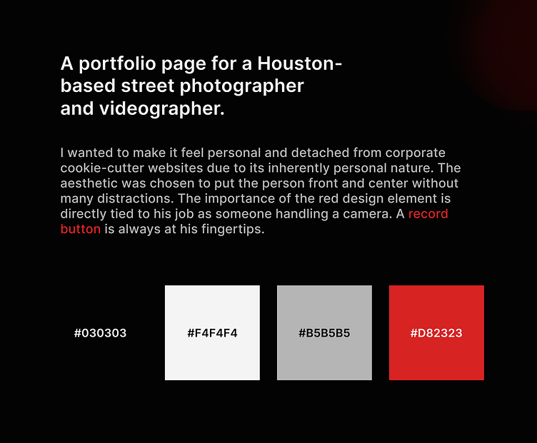
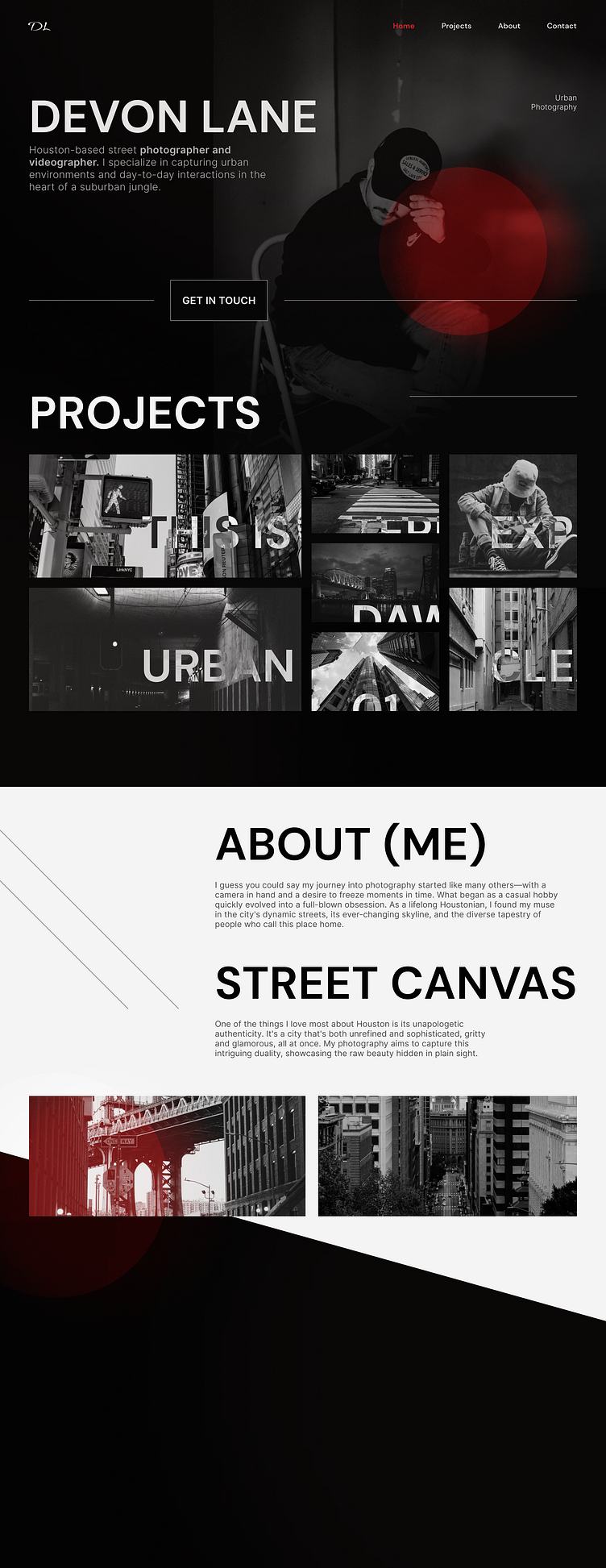
So, how does any of the above have anything to do with this website design? This time, I wanted to change the way I approach things. As you do, I went on ChatGPT to generate myself a myriad of web design ideas and chose a portfolio page. Mainly because I know I should be designing one for myself in the future. He didn't have a face, nor a name- so I had to start thinking about what kind of a person would this website belong to.
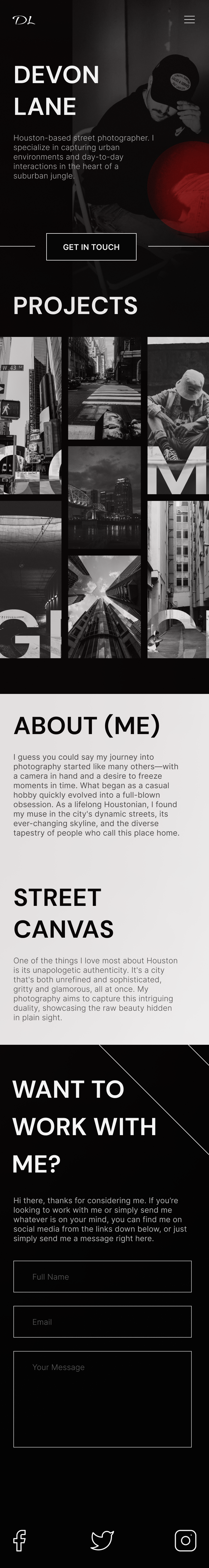
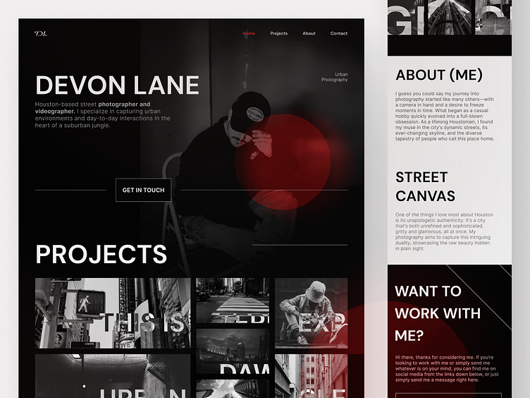
Instead of immediately going online to find inspiration, I started building the fictional character's image in my head and mapping out a general idea of who he is and what he does. I found some neat photos on Unsplash and I decided to focus on something more gritty and urban, hence why I chose a darker theme for the website.
Soon enough, further ideas started reinforcing previous ideas and I began to actually have a clear purpose and a goal to work towards with the design. I had created an entirely made-up personality from thin air and I had a purpose to portray him and his work through my design choices.
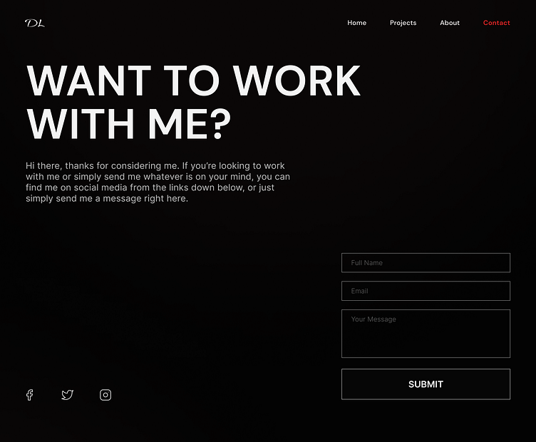
While the layout is basic, I chose it precisely because of that. I won't sit here and pretend like I'm some guru who will break norm and make anything work, because that is far from the truth. New designers seem to feel compelled to reinvent the wheel and I feel like a lot of the time I was shifting my focus onto uniqueness rather than functionality. Why fix what isn't broken? Hero sections and landing pages have been optimized already, so I strongly believe that juniors should stick to what works instead of trying to pull off the impossible and design layouts that nobody has ever thought of before.
In closing
If you've read this far, thank you for taking your time. If you like my work and my thoughts resonated with you, press L and drop a like on the project.
I am receptive to feedback and I'm constantly in flux absorbing as much information and knowledge as I can, so please don't hesitate to critique my work if you feel compelled to do so.
Thank you!