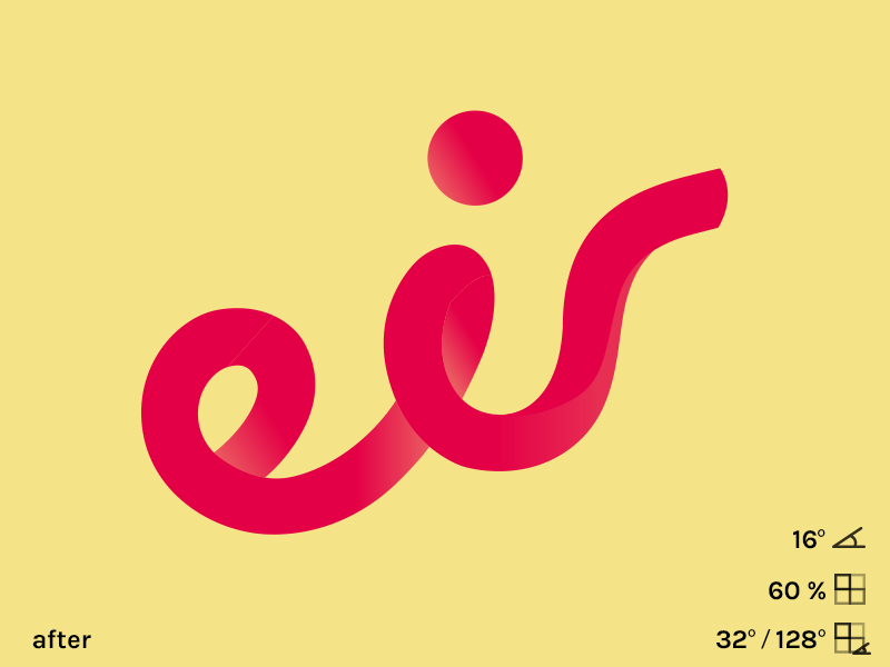
Reimagined eir.ie Logo

First of all—Hi Dribbble
I got inspired to redo the wordmarks "r".
Don't get me wrong I really dig the new logo! But in my opinion the "r" looks to wide and takes to much space when placed on applications. So I tried to make a more compact version.
Feedback is very much aprreciated.
PS thank you @prowebix for drafting me.


