Rockford House

🏴 Rebranding for an independent post-production company out of Portland.
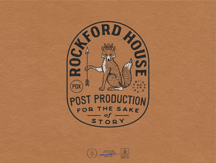
The client, Doug, felt that the company’s existing logo lacked personality, dimension, and intention. He wanted an elaborate hand-drawn design that communicates heritage.
🦊 I created an oval badge focused on a fox, the symbol of cunning, playfulness and resilience.
The character is wearing a crown - an emblem of tradition and authority, and holding an arrow - a sign of hard work and victory.
✏️ The typography is fully hand-drawn and consists of a bold semi-serif, two sans-serifs, a script, and a blackletter font. The overall vibe it gives off is vintage, supported by a simple, timeless color palette.
Once we perfected the master logo, we went on to develop a logo system consisting of multiple logo variations, wordmarks and submarks, a monogram, and a pictorial mark.
🚀 Lastly, we tackled business stationery and created an illustrated Instagram grid that is sure to grab attention of anyone who lands on Rockford House’s profile!
What do you think about this transformation?
💬 I’d love to hear your thoughts in the comments!


