Stripe - Form Accessibility

Stripe - Form Accessibility

Incorporating good WCAG contrast ratios on the payment page is essential because it allows me to adhere to accessibility best practices.
By prioritizing legibility and visual clarity, I create an inclusive environment where all users can comfortably engage with the platform, regardless of their visual abilities.
This commitment to accessibility not only aligns with Stripe’s values but also enhances the overall user experience, fostering trust and confidence in their services.
I relied on the "Contrast" Figma Plugin to verify the WCAG contrast ratios of colors and text.
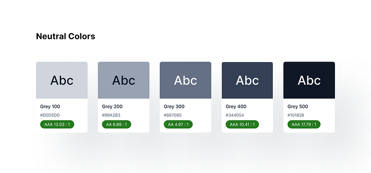
Gray
Gray serves as the foundation of our color system, offering a restful and calming background for the page's content. We carefully selected a range of shades that maintain appropriate contrast ratios, ensuring legibility and readability of text, form fields, and other UI elements.

Pink
The primary color, pink, acts as a bridge between restful and energetic tones. With calming and warm qualities, this pink variation, infused with a touch of blue, exudes tranquility while still maintaining a welcoming and nurturing feel. It creates a harmonious and pleasant atmosphere for users, perfectly complementing the page's purpose as a payment processing platform.

Red
Red is an attention-grabbing color, making it ideal for warning and error messages. However, we are mindful of its potential challenges for color-blind individuals. To address this, we ensure that warning messages are always accompanied by text labels for clarity. While red is a warm color, we use it selectively to convey urgency and prompt users' actions when needed.