Find designers
Designer search
Quickly find your next designer
Post a job
The #1 job board for design talent
Inspiration
Courses
UX Diploma
Learn UX design from scratch in 6 months
UI Certificate
12-week UI skill building for designers
Live interactive workshops
with design professionals
Jobs
Go Pro
Log in
Dribbble: the community for graphic design
Advance your career with a Professional Diploma in UX Design
Learn more
Log in
Sign up
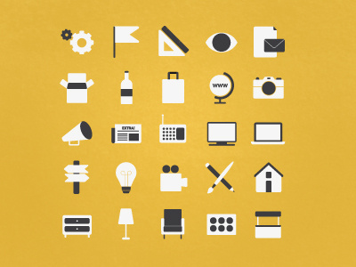
Icons
Bea Vaquero
Follow
Following
Like
#E2B53D
#EEC24B
#F4F4F1
#474543
#B09143
#CDC09C
Download color palette
icons
work
View all tags
Posted on Jul 28, 2011
3,119
19
120
11
View feedback
Bea Vaquero
More by Bea Vaquero
View profile
Previous
Next
Loading…