Experiments in mobile navigation

Been doing some thinking lately about mobile navigation, and some potential alternatives or slight variations on the go to hamburger menu set up.
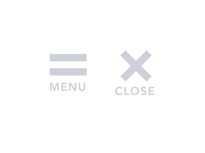
I've never really been a fan of how the hamburger icon looked, but I've also not always able to be as ballsy as Apple is with their two line icon when Im doing client work.
What I'm thinking about trying on my current project, is swapping out the bottom line for a label, which has been shown to increase usability.
This also leaves room for an extremely smooth transition. Any thoughts?


