PiggyBank - 404 Page

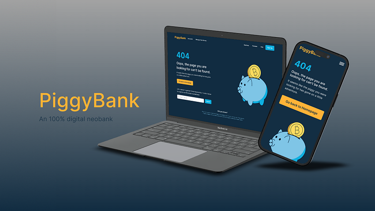
PiggyBank
A fictional 100% digital neobank that is aimed at changing the landscape of financial services that need a 404 error page that is helpful and in line with your brand voice and style.
Content Strategy Challenge at Uxcel
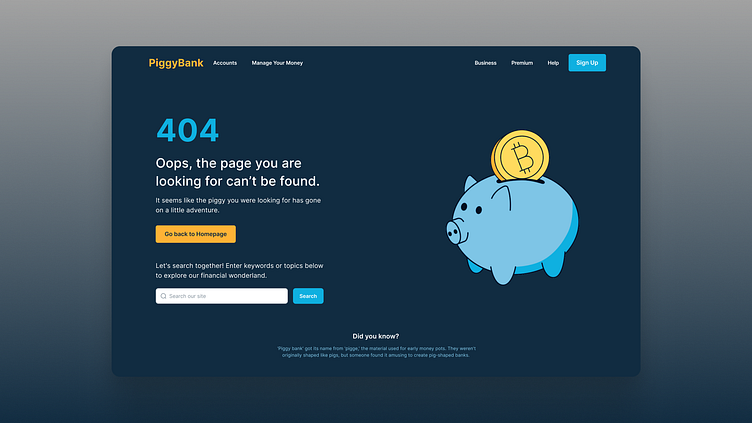
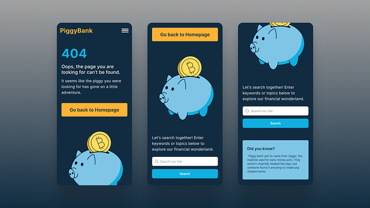

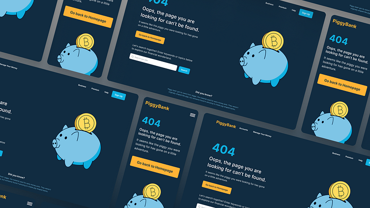
The color choices on the PiggyBank website have specific meanings and associations. Dark Blue for the background represents serenity and trust, while Light Blue accents add energy. The Warm Orange as a highlight color brings excitement and draws attention. These contrasting colors create a visually striking contrast and enhance the user experience.
Blue is associated with serenity and trust. Many banks and insurance companies use blue to convey security and trust. Orange, like yellow and red, represents bursts of excitement and enthusiasm. It grabs attention and sparks energetic vibes. Sports teams often use orange in their branding.
Blue and orange are complementary colors, creating a visually dynamic contrast when used together. This contrast enhances the visual impact of the PiggyBank website, drawing attention to important elements. The deliberate color choices combine the calming and trustworthy nature of blue with the energetic and vibrant qualities of orange, creating a visually engaging and memorable user experience.
The PiggyBank website's color choices reinforce the brand's image as a trustworthy, professional, and vibrant financial services provider. It creates a user-friendly experience that elicits trust in the offered services.
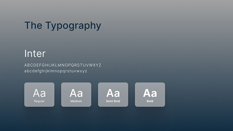
The PiggyBank website utilizes the Inter typeface in different weights for optimal readability and visual hierarchy. Regular is used for body copy, Medium for subheadings, Semi Bold for headings and buttons, and Bold for key highlights.
White is predominantly used for longer written text, while orange and light blue serve as subtle accents. The PiggyBank logo stands out in the highlight orange.
The versatile Inter typeface ensures legibility and works well for general interface needs. Different weights create visual hierarchy, while white text enhances readability. Orange and light blue accents add visual interest, and the PiggyBank logo stands out in orange for brand recognition.