Mommy & Me - Logo and identity design for children's brand


The Client
The client approached us to create a logo and branding for Mommy&Me children's mattresses. We saw this as an exciting opportunity to challenge ourselves beyond our usual tech niches.
After analyzing the visual communication and positioning of the competitors, we came to the conclusion that our brand should be playful, warm, open and empathetic.
Logo ideation
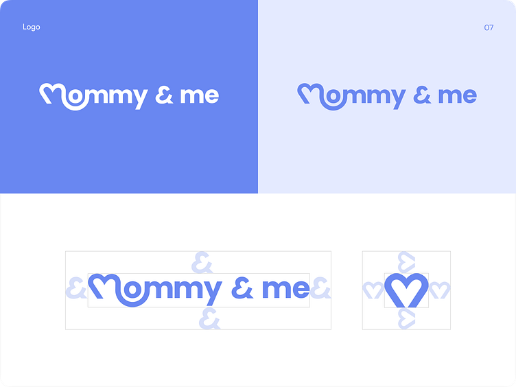
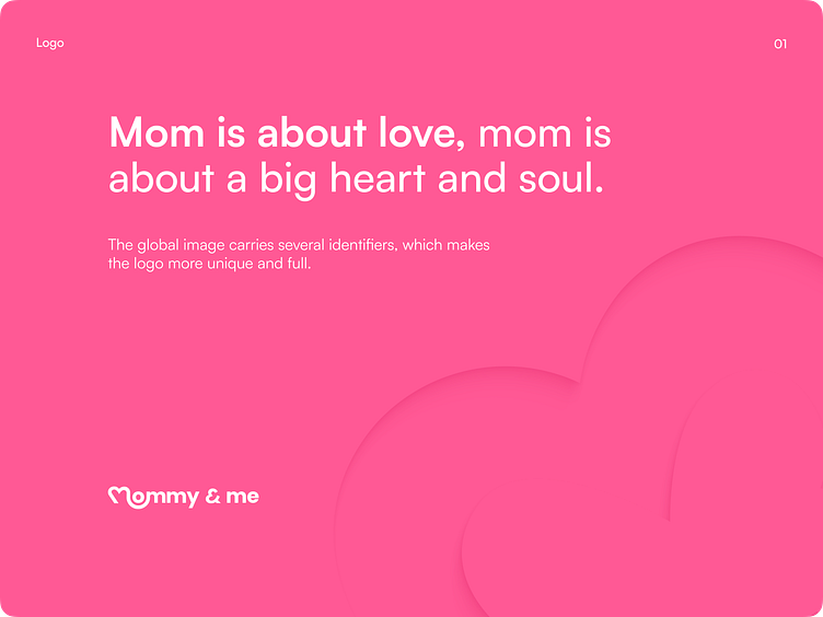
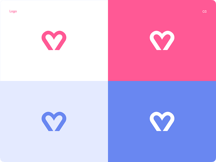
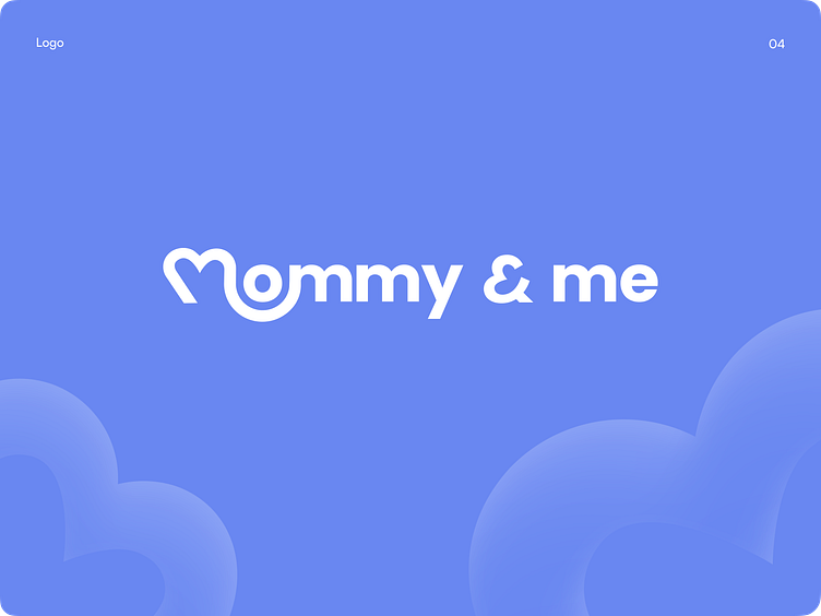
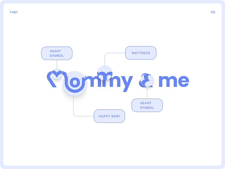
Mommy is primarily about love, so the main symbol of the brand was a heart, which is stylized as the letter M in the word "Mommy" and the stylized symbol &, which created a unique and recognizable brand image.
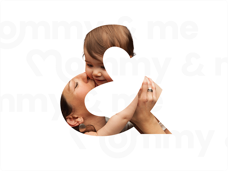
We represented the inseparable connection between mother and child in the logo by combining symbols to create an image of a child and a heart.
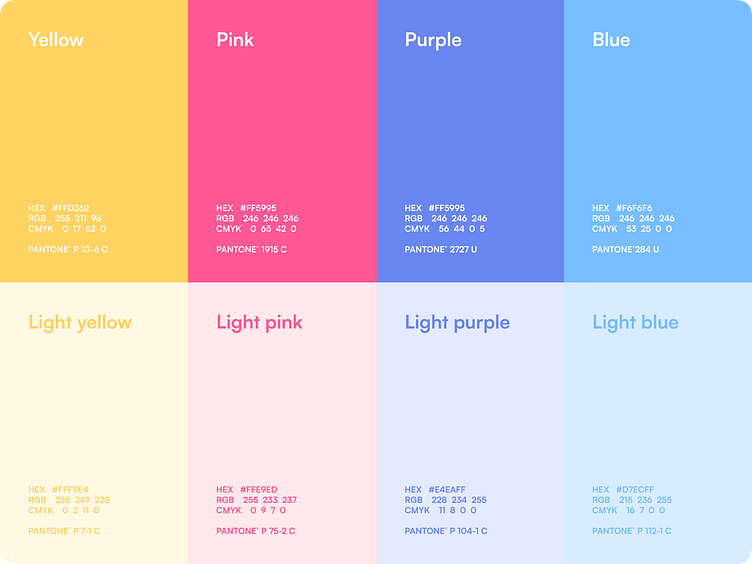
Color palette
The color palette combines accent colors and their pastel variants:
Yellow is responsible for joy and happiness
Pink for excitement and playfulness
Blue for calmness and trust
Purple (the main brand color) symbolizes emotions, premium and quality sleep
Results
The product our team created should become a highly recognizable and flexible brand that wins the hearts of parents worldwide with its openness and global empathy.