Lucha Libre: fun marketing art direction!

Some exciting new content! Whew... It's been way too long since I have posted something. Too busy, thinking my stuff it not really Dribbble-worthy, I guess it is fairly relatable situation for the most of us. But it is time to (at least for now) break with this dogma.
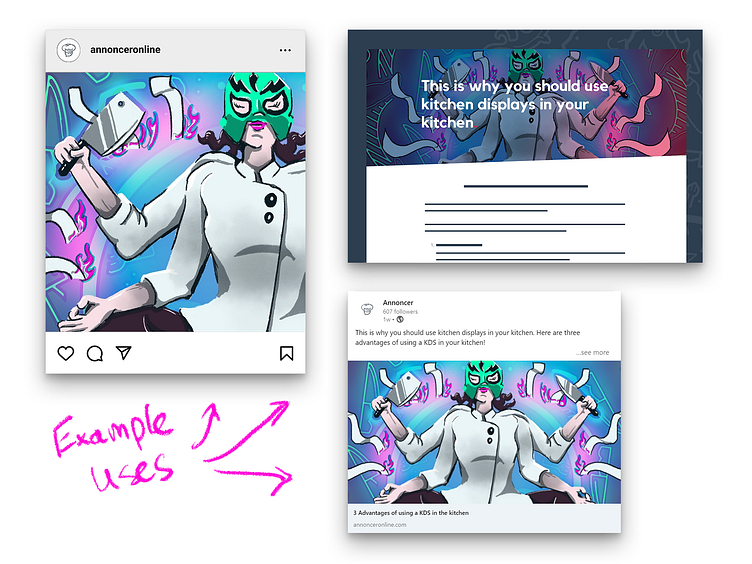
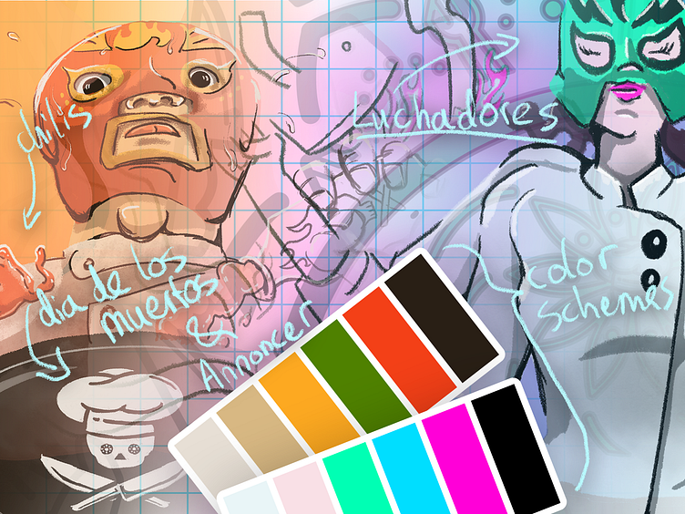
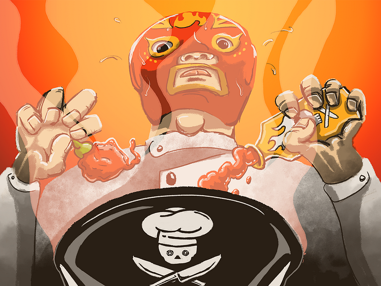
First up: a little marketing project for Annoncer. I tried something new here, intentionally loosening up my art style and using a crayon aesthetic and not coloring inside the lines too strictly. Also, I wanted to break free from the traditional color scheme of Annoncer to introduce some more fun and liveliness in our marketing.
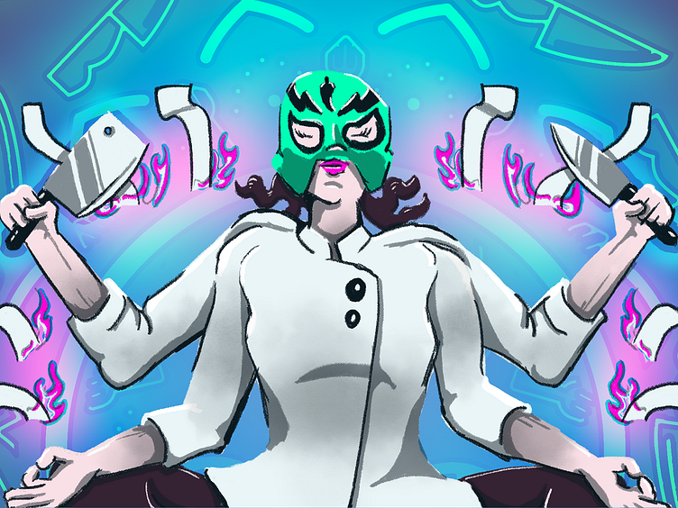
So these images are great on their own, but because it is marketing they end up in various places, in various sizes and aspect ratios. How did I deal with it? I started out with a common denominator: try to find a sweet spot when designing my banner. I needed a square ratio for Instagram, somewhat rectangular for LinkedIn and a rather wide aspect ratio for our website's blog. At least, the area of interest needed to be in a square. Then, for slightly rectangular aspect ratios, I would still make the drawing interesting by adding elements that are not essential but add value to the drawing. Like the pattern in the background of the meditating Luchadora. For extra wide ratios, I did not really do much, as those are intended for flexible cropping. The least I could do, was make sure that the area of interest is always in view and extra extension beyond this is consistent with that (the background pattern and the background gradients would continue very far into the wide image).
I hope you like it! How do you approach art direction? Any cool marketing parallels with my story? Or is there anything I can improve? Or do you have any questions? I am glad to hear from anyone here! 😀
Peace out! ✌️