CHICCI - Specialty coffee app


Intro:
During my studies to become a UX designer, while working as a specialty coffee barista in Milan, I noticed several aspects of my job that needed improvement. This led to the creation of Chicci, an app that serves as a barista in your pocket, guiding customers through the selection of coffee beans based on their taste preferences. In this project, I got to mix my two hobbies, coffee, and UX design.
Problem statements
From the Baristas:
Difficulty in providing desired assistance to customers seeking coffee beans during peak hours.
From the Customers:
Customers may find it overwhelming to choose from a variety of coffee bean options.
Busy baristas can leave customers to make decisions on their own.
The café's website often provides outdated information about the available coffee beans, leading to disappointment.
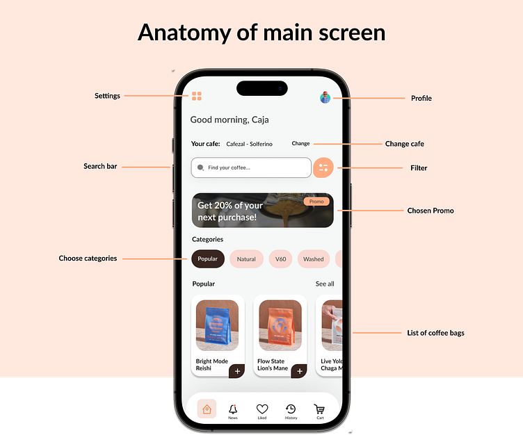
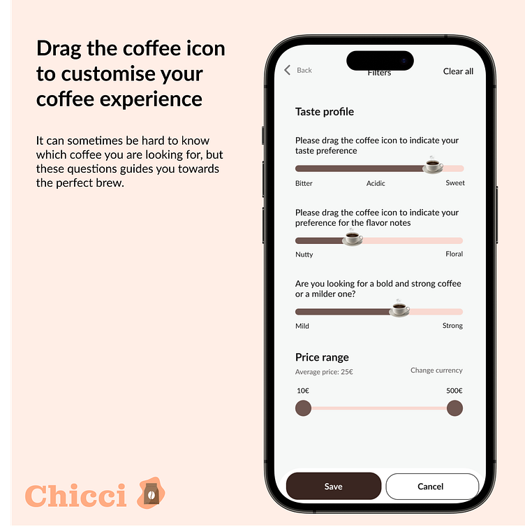
Solution 1
By adding a filter option, the user can have a dialogue directly in the app with a barista by answering a set of questions. The app will then show alternatives of coffee beans that fit the user’s description.

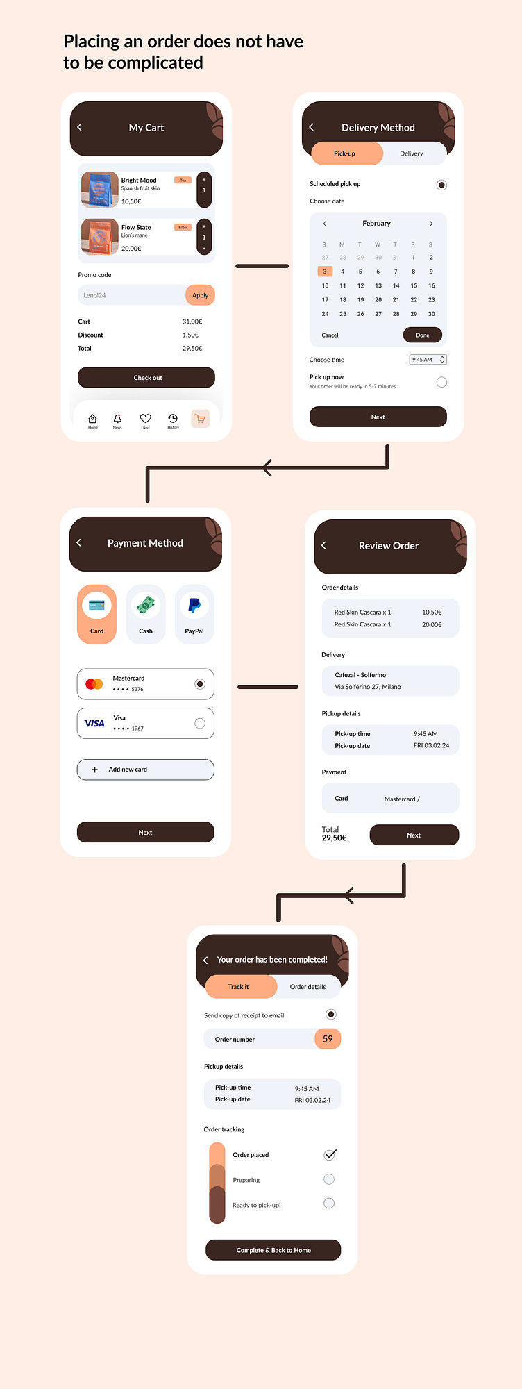
Solution 2 - Place an order directly on the CHICCI App. 🛒
You can choose to pick up your coffee bag in the coffee shop, or if you want it delivered directly to your home.
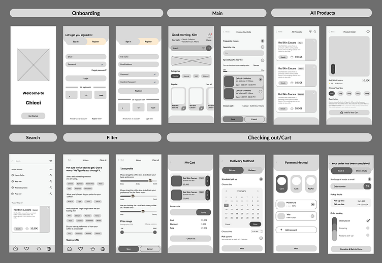
Sketches
The wireframes enabled us to test the concept and adjust specific areas before investing in Hi-fi design and development time as wireframes are the cheapest stage to make mistakes in.

Ideation
We then transformed the ideas into an interactive low-fidelity prototype, which was tested with five potential users to gather feedback.
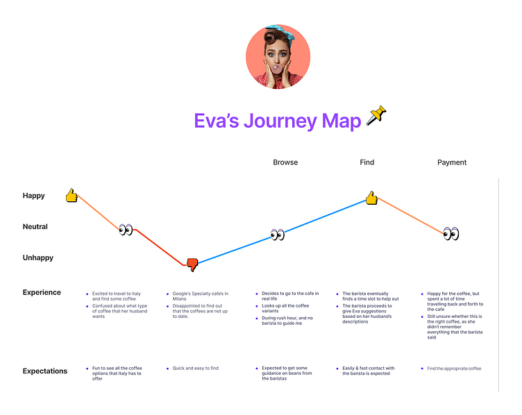
Eva's journey
To highlight the difficulties people face when searching for coffee beans online, I created a user journey visualization.

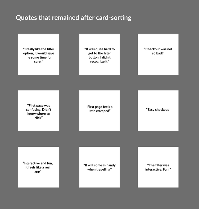
Usability Study & Card-sorting
A usability testing session was conducted with four participants who envisioned using the app in the future. The responses were analyzed using a card-sorting exercise to identify common themes among the participants.
Major Design Iterations: ♾️
User comments and suggestions were carefully considered to provide the best possible user experience. The goal was to create a product that was easy to understand, efficient to use, and enjoyable to interact with. User feedback played a crucial role in implementing these changes.
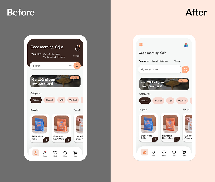
Comments about the first page from the usability test and my design solution to meet those.
Concern: ‘’The first page feels a bit too cramped!’’
✅ Add more blank space, making the design more breathable.
Concern: ‘’It was quite hard to get to the filter option’’
✅ Made the filter option stand out more on its own in order to increase awareness.
Concern: ‘’The first page was confusing, didn’t know where to click!’’
✅ Improved contrast between text and background
The Final Design


