iOS Icon
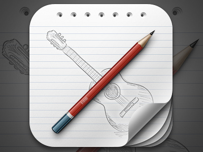
Icon for a guitar learning app. The metaphor was selected by the client himself. Initially, I suggested to use a chalkboard, which, I thought, would show the concept of - 'learning' in a nice way. But the client thought that a pencil sketch on paper would look better.
Personally, I found the paper-sketch idea interesting and thought to give it a unique look. I am quite happy with the outcome so far.
While working on the icon, I learned something new. Instead of creating three different sections for the red part, I used a single layer with a rather complex gradient. Used the same technique for the white stripe and the blue end.
Don't forget to check the full view. Suggestions will be appreciated.


