Find designers
Designer search
Quickly find your next designer
Post a job
The #1 job board for design talent
Inspiration
Courses
UX Diploma
Learn UX design from scratch in 6 months
UI Certificate
12-week UI skill building for designers
Live interactive workshops
with design professionals
Jobs
Go Pro
Log in
Dribbble: the community for graphic design
Advance your career with a Professional Diploma in UX Design
Learn more
Log in
Sign up
Status indicators
Paul Stanton
Follow
Following
Like
#E7E7E7
#21201E
#9F9D9D
#676767
#B04E30
#403F3E
#D3B1A4
#D1935C
Download color palette
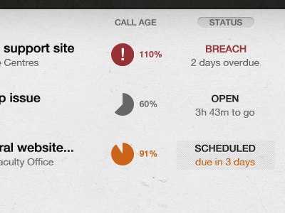
Still playing with how to indicate status, without going over the top with colour coding
helpdesk
list
mmm pie
progress
status
ticket
View all tags
Posted on Jul 25, 2011
4,712
1
10
6
View feedback
Paul Stanton
More by Paul Stanton
View profile
Previous
Next
Loading…