Josty Brauerei Apartments - branding


Hey there 👋🏻
Today, we'd like to share the results of a project made for Josty Brauerei Apartments, placed in the heart of Berlin. Its location makes it a perfect choice for a short business or holiday trip. The apartment complex was built in a courtyard, separated from street noise, making it a quiet and somehow hidden place.
Josty Apartments did not use any form of visual identity in the past. The need to create a new website prompted the hotel's owners to invest time in branding that would make Josty distinctive and recognizable from other similar facilities in the area. To make it happen, we proceeded with a new logo and brand identity exploration first.
Our approach & historical context
The historic facade of the building served as the main inspiration for the brand's logo. The characteristic arches of a 19th-century red brick tenement house naturally led to a exploration of serif fonts and window-like shapes.
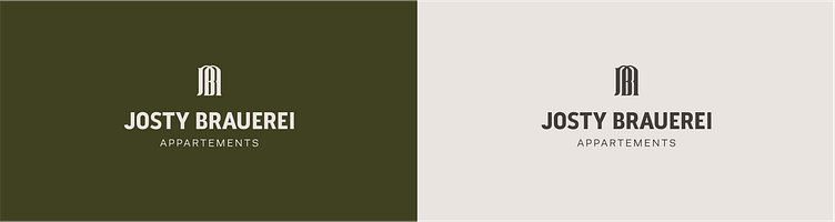
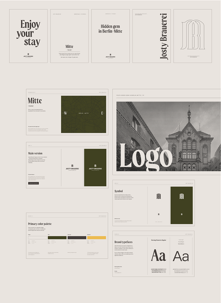
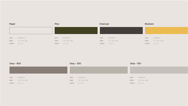
We considered the historical use of the building itself - a brewery established by Daniel Josty in 1890 - when developing a visual identity. Josty's color scheme is influenced by both the building's heritage (green - hop cones) and the hotel's surroundings (yellow - Berlin's public transportation).
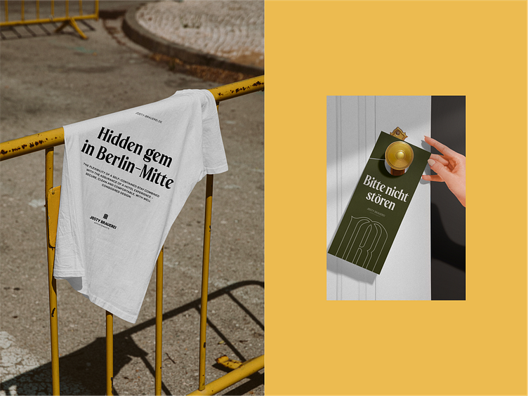
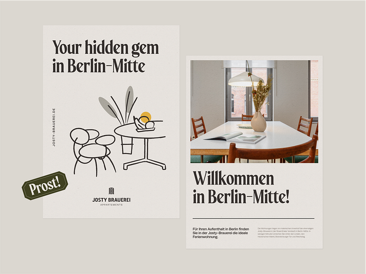
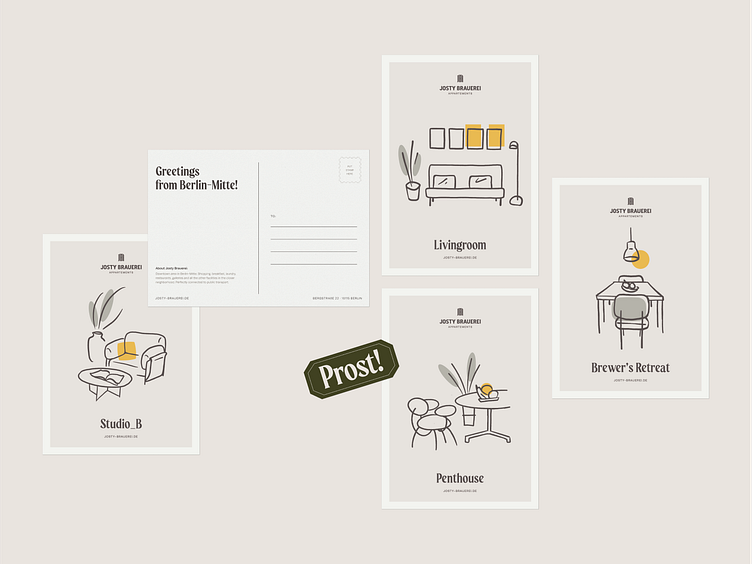
Souvenir to take home
Additionally, we created a collection of postcards to be given as gifts to Josty's visitors. Each illustration resembles a distinctive section of the room's interior for easier recognition.
That's for now! You can see the full case study on Behance. Follow us for the upcoming updates of that project - there is definitely more to come!


