Tebix logo concept pt.2

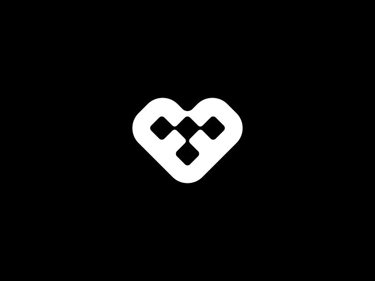
I'm excited to share another logo concept that I have explored for Tebix, a software development company focused on B2B services, offering subscription management, billing and invoicing, B2B marketplace, and more.
This concept represents a geometric shape of a heart with a 'T' inside, created by connected squares. The heart symbol in the logo represents Tebix as the essential core of business management. The 'T', formed by interconnected squares, signifies Tebix as a hub that unites diverse business elements. Each square represents a unique service or entity, seamlessly integrated by Tebix's management services. It's a symbol of Tebix's role as a connector and integrator in the business world.
I'd love to hear your thoughts on this concept!
Let's work together! ✉️
Let's connect! 🔗