ConverSight’s rebrand: The logo


Revitalizing AI analytics with a fresh logo
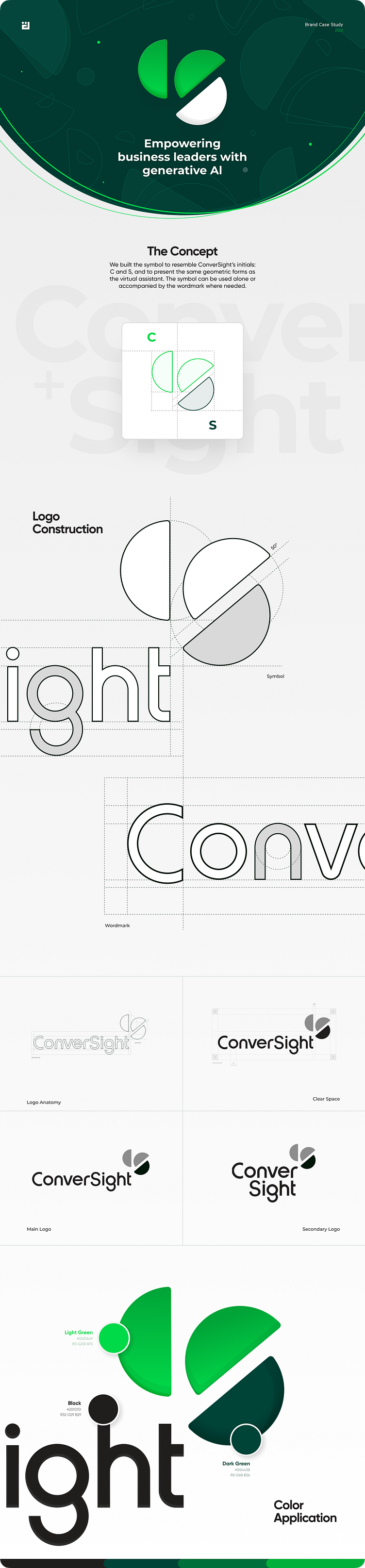
ConverSight is an augmented analytics tool that combines AI with traditional methods to improve data insights, data exploration, and decision-making for businesses. ConverSight's rebrand called for a new visual language to convey complex data concepts simply and amicably.
We started off by crafting a symbol that seamlessly integrates shapes that evoke data visualization. Additionally, we included ConverSight's initials right into the design, ensuring that it is distinctive and memorable.
For the wordmark, we played with an organic, custom typeface that would aesthetically be in harmony with the symbol, as well as with its primary typeface, Montserrat.
We have produced two logo variations utilizing these two elements - one designed for horizontal space settings and the other for vertical ones. This guarantees that the logo will have an optimal visual impact regardless of its orientation.