Fitness App - FitFlow UI Design


Description:
I designed a fitness app's UI with a focus on simplicity and usability. The goal was to create an app that would be easy to use and navigate, while still being visually appealing.
The app features a clean and modern design with a focus on white space and negative space. The colors are bright and vibrant, and the typography is easy to read.
I have gained knowledge about the following thanks to this project:
Stick the bottom navigation bar to the bottom of the screen while scrolling.
Effective Prototyping.
Micro-Interactions.
I learned about key elements for a fitness app.
Typography :
I've used Avenir as the only font for this app, as it is a versatile font. It has a modern and minimalist feel to it.
Reasons why I've used Avenir in Fitness App UI design:
It is easy to read. Avenir is a sans-serif font, which makes it easy to read on small screens.
It has a modern look. Avenir is a modern font that has a clean and minimalist look.
It is versatile. Avenir can be used for a variety of purposes, including headers, body text, and icons. This makes it a good choice for fitness apps, which often need to use a variety of fonts to create a cohesive design.
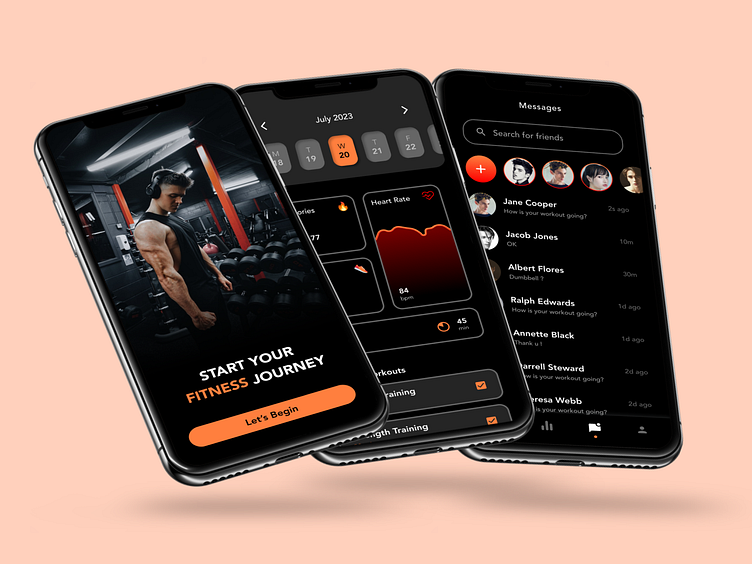
Color:
I've used #FF7F3E as the color for the Fitness UI App Design with a background of solid black color. It is a shade of orange that is often associated with passion, motivation, and excitement.
Reasons why I've used #FF7F3E in Fitness App UI design:
The combination of #FF7F3E and a solid black background creates a striking and eye-catching contrast.
#FF7F3E is also a bright color, which means that it can be easily seen and read. This is important for fitness app UI design, as users will often be using the app in bright environments, such as gyms or parks.
#FF7F3E is a versatile color, which means that it can be used to create a variety of looks and feels.
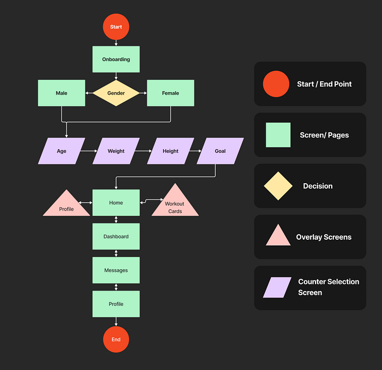
User Flow:
This is the User Flow on which I based the creation of my entire app. The key challenge was determining how users would navigate the app. At that time, I created these user flows.

Wireframes:
These are the wireframes I created in a mid-fidelity level before creating a high-fidelity design for the user interface.
And lastly, here is the prototype video of the app:
I hope you enjoy my fitness app's UI design! If you have any feedback, please feel free to leave a comment 💬.
Contact me at:
👨🏻💻 Dribbble


