Portfolio website - UI Design - Framer

Personal website I'm currently designing in Figma and building in Framer.
It's not only meant to showcase my work, but also tell what sets me appart as a designer. Therefore it contains a page called 'thoughts', which provide a short and extended version of my vision on what makes good design.
The idea here is to visually communicate what I stand for a designer, but also what makes me, me.
It's partly dark, communication determination and ambition. While at the same time keeping for clean, simple, and 'easy on the brains' as I like to call it.
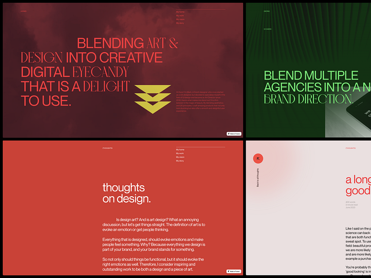
To create a coherent, rather than consistent, design. I repeated certain patterns and choices, rather than exact colors and typeface. For example:
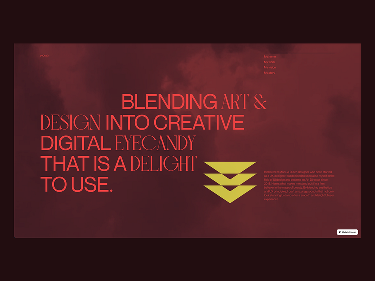
The homepage is color on color. Using a dark color on the background and a light color of the same hue value on top of it. Both the home and the 'work' overview page contain this pattern.

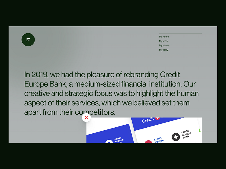
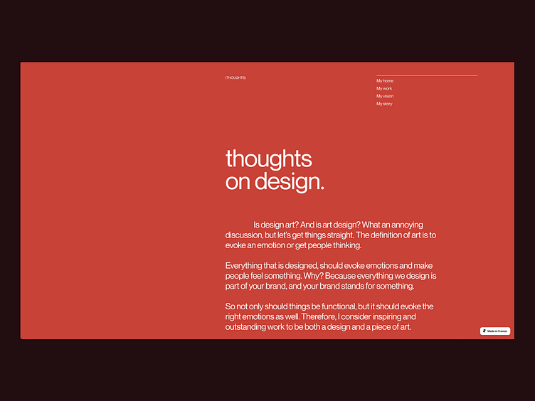
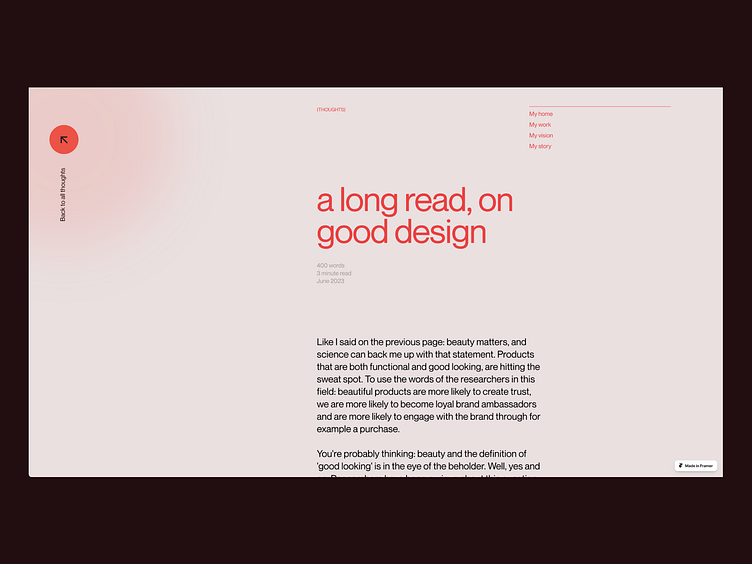
Speaking of patterns and a coherent whole: all detail pages get a light color, based on the color on the previous overview page. For example, light red when you are coming from a dark red page, and light green when you are coming from a dark green page.
This way you see a connection between pages and visually know you are still within the same section.