Find designers
Designer search
Quickly find your next designer
Post a job
The #1 job board for design talent
Inspiration
Courses
UX Diploma
Learn UX design from scratch in 6 months
UI Certificate
12-week UI skill building for designers
Live interactive workshops
with design professionals
Jobs
Go Pro
Log in
Dribbble: the community for graphic design
Log in
Sign up
Settings View
Max
Follow
Following
Like
#161616
#5CAAE1
#A7D2F0
#D4E7F5
#A9B3B9
#545C61
#1675BC
Download color palette
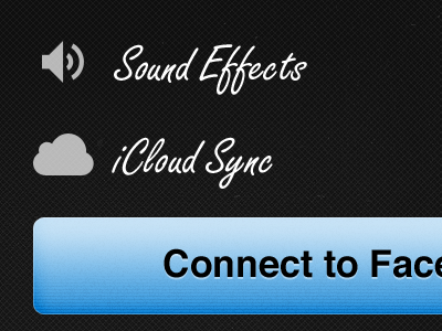
Check out the attachment, I'm trying to keep the settings down to a bare minimum.
icloud
iphone
stacks
ui
View all tags
Posted on Jul 24, 2011
878
1
6
4
View feedback
Max
More by Max
View profile
Previous
Next
Loading…