Branding design concept for a crypto platform | Lazarev.


Let’s talk about branding. It’s a robust tool that visually embodies your company’s essence and leaves a lasting imprint on your audience’s minds and hearts ❤️
Put together a memorable brand identity, a powerful value proposition, and a seamless design, and you’re unstoppable.
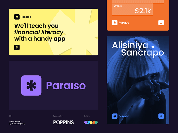
But let’s get back to our brand design for a crypto platform. We went for an asterisk logo to enhance the platform’s security and transparency about users’ spending and profits.
Typography-wise, our team opted for Poppins. This typeface spells openness and enhances readability. We aimed to feature clean, well-defined shapes with precise angles and curves. It works well with an overall crypto design and emphasizes a sense of order and structure — just what one needs for a Web3 app, right?
Now, let’s move over to the color palette. We combined vivid hues with a dark mode to give users a sense of the futuristic nature of Web3 design and highlight key interface elements. Our team also avoided extra vibrant colors to avoid overwhelming and throwing users off. It’s all about balance 👌
There you have it. What do you think of this brand and the crypto concept design overall? Share your feedback in the comments.
💌 If you need the branding to build your product’s unique visual language that aligns with strategy and marketing, we’re the digital product design agency for the job. Tell us about your project at hello@lazarev.agency.
Website | Facebook | Behance | LinkedIn | Instagram | Twitter


