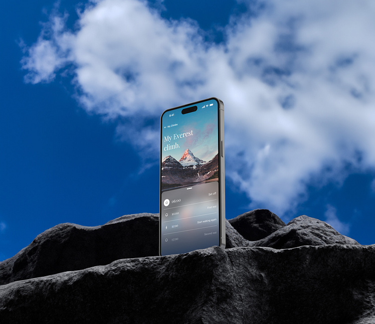
Climbing app in 3 UI styles

I've recently been contemplating how much of an impact a designer has on everything to do with a product.
The UI style we choose sets the tone for whether the target users will enjoy using the app, the information which can be displayed, the tone of voice of the entire company.
so I decided to create 1 app in 3 different styles.
Clean UI
The first is clean UI, simple image at the top, text on a white background, using greys and blacks to aid typographic hierarchy.
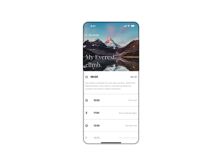
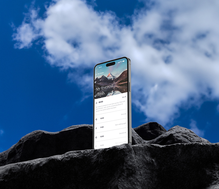
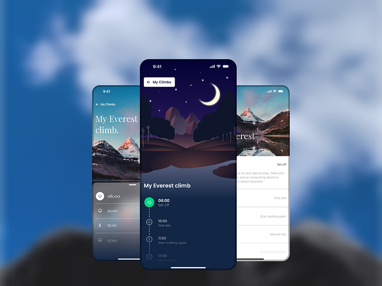
Illustration led
The second was using illustration rather than photographs, this naturally led to a more playful young feel. As an extra twist I created this in dark mode.
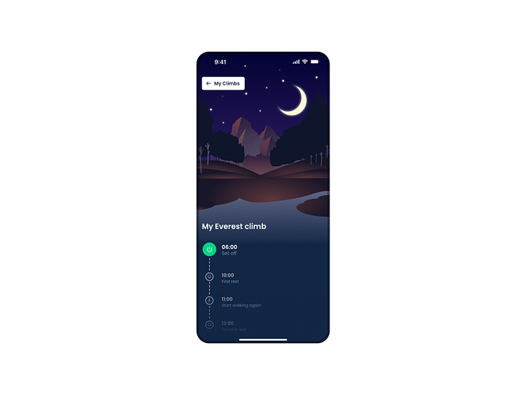
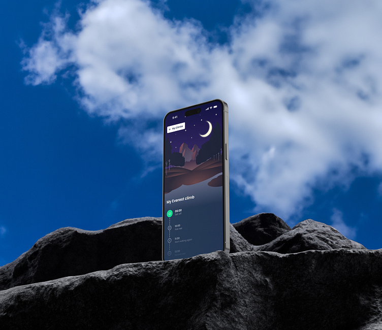
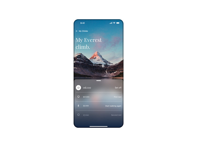
Image led
The final was image led, I wanted this one to use inspirational images which were a focal point and attention grabbing. This caused many accessibility issues across the typography which I have yet to fix!