Surfacing Post Errors Case Study

Project Overview
As a part of a larger project to tackle post reliability, the Surfacing Post Errors project served a dual purpose of providing Cloud Campaign customers with greater transparency on post failures and of equipping our internal team with a breakdown of said post failures to further increase post success rates.
Teams and My Role
Members from teams across the organization were involved including product, engineering, marketing, customer success, and sales. I acted as the sole UI/UX designer.
Problem
Post reliability has a success rate of below 50%. We are unable to provide our customers immediate feedback on as to why their post has failed.
Solution
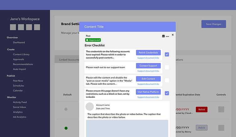
Restructure the way in which post error messages are stored and tracked. Surface the error messages and provide client facing information.
Key Points of Consideration
How to translate the technical post error messages appropriately for customer viewing
Design with technical restrictions and future improvements in mind inclusive of character limitations due to space, functionality given the legacy code, and the different areas of implementation
How to add value and maintain trust with our customers
Key Points of Reflection
I gained more experience speaking with customers, facilitating user interviews, and carrying out usability tests.
I experienced the importance of flexibility and optimized task management to better tackle scope creep/change.
I have a higher level of admiration for team members who work directly with our customers on a daily basis.
Research
Initial Information & Actions
One of the biggest business goals of the year was to improve post reliability and bring up the post success rate to 98%. Earlier we discovered significant friction between customers and the platform when it came to post failures. Without clear understanding of why their post failed, customers were left in the dark for too long. It affected the efficiency of their social media scheduling which works against the mission of Cloud Campaign.
This project was broken down into several phases that started with backend restructuring. The engineering team discovered better ways to store and track the post errors. The next step involved translation of post error messages into colloquial and industry approved language for Cloud Campaign users.
Ideation
UI/UX goals for this project:
Provide transparency, immediate feedback on post failures
Clean up workflows for reposting content
Utilize the space and keep the design clean/structured
Create opportunities to gather metrics for the business
User Experience & Feasibility
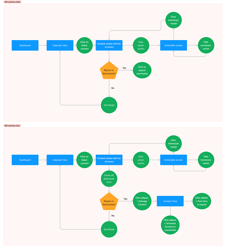
During the initial stages of the design process, I was working under the assumption that our users would be able to get immediate feedback on the actions they take on a failed post. Those actions could include editing content to fit requirements, renewing a credential, and any other actions taken to address the error. This assumption allows for posts to be rescheduled or reposted from the post error screen. However, given feasibility constraints, we were unable to provide that capability at the time. This shifted user experience flows as well as the visual design. Below images depict the initial and adjusted user flows.
Iterations
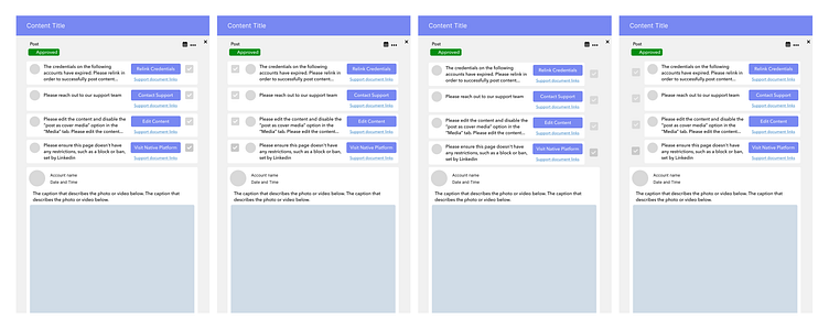
Below are some of the key iterations that took place for this project.
As previously mentioned, the initial experience for the post errors project relied on the premise that once the user has addressed the error through the button entry point in the modal, that action taken would be reflected automatically.
The button would change into a green checkmark icon in this case. However, given the increase in scope and weighing out the factors of time, resource, and value, we decided upon an initial release of a manual process.
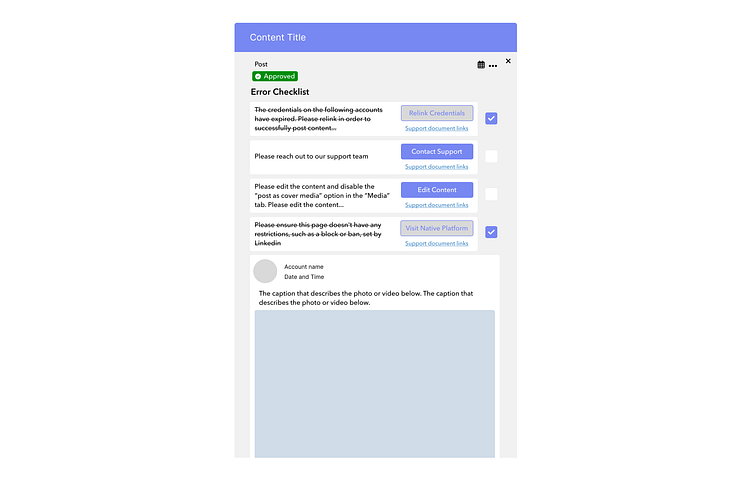
The iterated design reflecting the changed user flow is shown below. The experience became manual in that once an error was addressed, the user would have to check it off. Upon checking off the item, the button, which acts as an entry point, would become disabled.

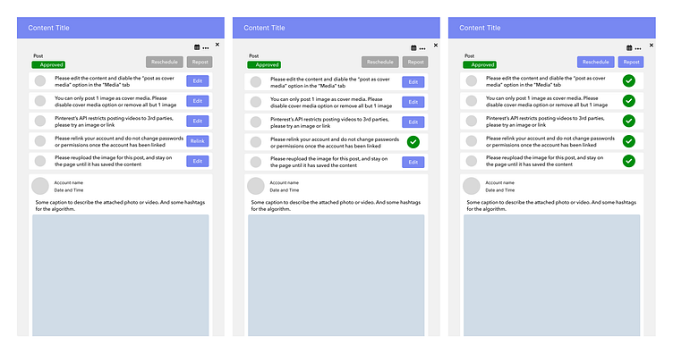
Having addressed feasibility and functionality with regards to user experience, we did have a few iterations of the placement of specific elements. One of the decisions was in relation to the location of the checkbox icon. Through internal A/B testing and external A/B testing, we came to the conclusion of the third version with the checkbox to the right and separate from the card that holds the message, the button, and the support link.
Shown below, is the final design. Additional visual changes and behavioral changes were applied.
The reschedule and repost buttons are removed.
The checkbox, when unchecked, is an empty square.
The button is disabled once the checkbox is checked.
The error message is struck through once the checkbox is checked.
Results and Reflection
After the release, we received many positive responses with regards to the usefulness of the surface level errors. Through the transparency, customers are able to pinpoint aspects of their content prep that cause post failure. For post failures beyond the control of Cloud Campaign, we are able to provide more immediate awareness of the issue. This shortens the amount of time our customers are in the dark. This project highlighted the importance of communication whether it was with internal team members, customers, and leadership.


