Yeppo & Soonsoo homepage redesign

Yeppo & Soonsoo stands as the foremost K-lifestyle retailer in Finland, boasting years of market expertise, a network of physical stores across the country, and a dedicated customer service team. Additionally, they operate a comprehensive webstore with an extensive catalog ranging from cosmetics to accessories, gifts, and decorations.
In my capacity as a brand identity designer, I collaborated with the esteemed K-lifestyle brand Yeppo & Soonsoo to reimagine their identity, ensuring a closer alignment with the preferences and needs of their discerning clientele. The focus of our collaboration centered on enhancing the memorability of their visual identity through the incorporation of illustrated mascots and a vibrant color palette, drawing inspiration from the rich tapestry of South Korean sights and culture.
It is important to note that the scope of the project did not encompass a web redesign. Leveraging my expertise as a UI/UX designer, I initiated a personal project to create an updated version of the webstore interface.
Key Findings
Upon scrutinizing the (now outdated) home page, it became apparent that the layout suffered from clutter due to infinite scroll, varied call-to-action buttons, features, and feeds. The products, the focal point of the platform, were nearly lost in this chaotic flow, compounded by a lack of full responsiveness.
Characteristic of a large-scale webstore, Yeppo's homepage featured a multilevel navigation system categorized further into subcategories. While functional on desktop, it was not optimized for mobile use—an issue that extended to background images.
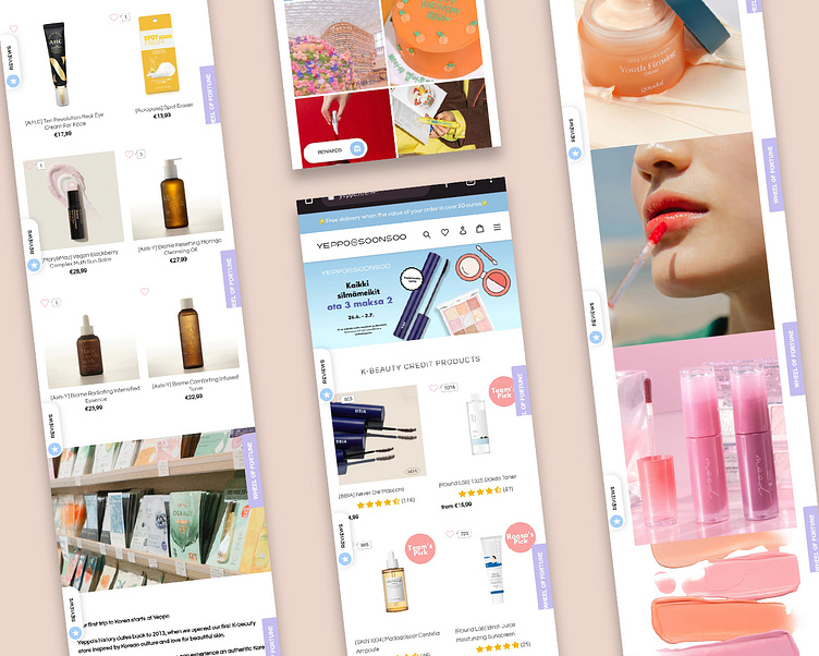
Above: The old homepage on mobile. Notice the sticky CTAs on each side of the screen.
Solution
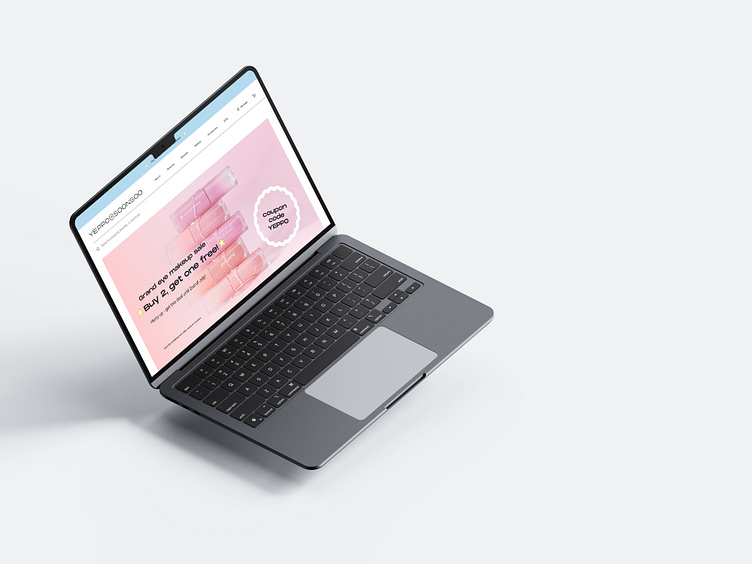
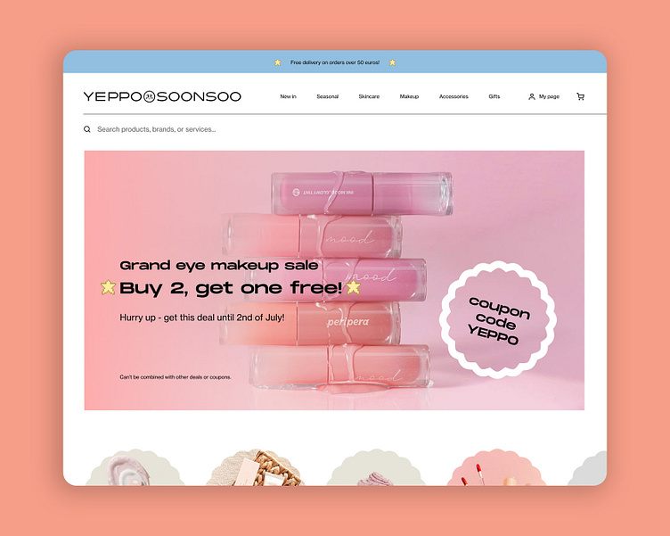
In my redesign efforts on Figma, I concentrated on upgrading the user experience by decluttering and optimizing performance, specifically on the homepage. While preserving the navigation style, I revamped its mobile version to occupy the entire screen when opened, thereby increasing button size for improved usability.
A primary objective was to bring products to the forefront. I achieved this by introducing a card-based category header featuring product images. Additionally, I refined the style of featured product images, providing these cards with a distinct background color to enhance visibility. To further emphasize the products, I reduced the prominence of social media posts and other images on the front page.