Las Vegas Athletics

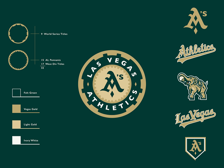
My thoughts on what an Athletic's brand update might look like if/when they move to Vegas. The poker chip is an obvious direction but I like how it creates an opportunity to tell the franchises history; 9 dashes for World Series Titles and 32 notches represent 15 AL Pennants and 17 West Div Titles. I feel there's potential to tweak the traditional A to incorporate a diamond as a nod to the cities rich history with playing cards as well as baseball's name for its field of play. Also included is a subtle upgrade to the Athletics script and a Las Vegas version in the same style. Lastly a modern version of the classic A's elephant aka Stomper.


