Name a bigger downgrade: The absence of shadows in iOS UI design


The absence of depth, shadows and elevation in iOS styleguides has been a topic of conversation and debate among UI designers for some time now.
⏱️ 2 mins full read.
10 years ago, Apple Inc. took a big leap forward by introducing a whole new user experience design for its iOS operating system. One of the biggest changes was the removal of skeuomorphism, a design philosophy that imitated the look and feel of real-world objects. Its absence caused a stir among users and designers since then.
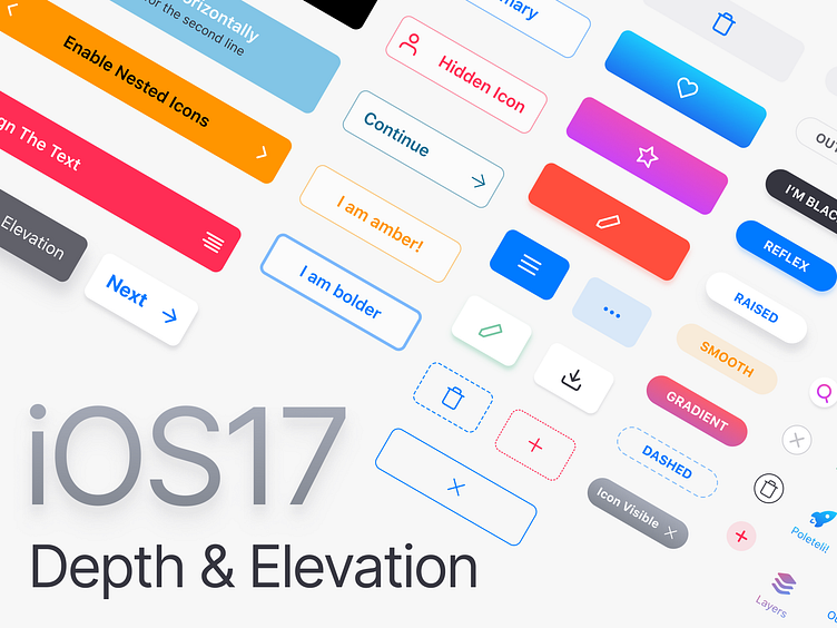
Though time has passed, some still argue that Apple should bring back the depth that was once a hallmark of their UI design. The release of iOS 17 has brought about a noticeable change in the GUI. We see increased use of shadows and a greater emphasis on depth, providing a more tactile and immersive experience for users.
This shift represents a departure from the flat, two-dimensional design that characterized earlier iOS releases, and has sparked a renewed interest in the importance of depth in UI design.
Originally published 👉 https://setproduct.com/blog/depth-in-ios-design


