Elusive Fire

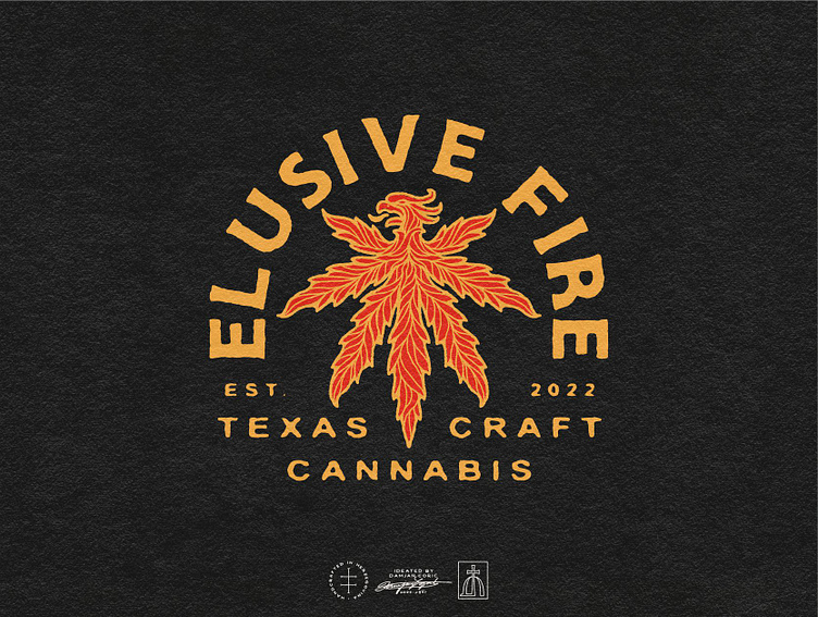
🏴 Logo design for an urban grassroots can*abis grower out of Texas.
The client envisioned a classic, masculine logo that plays on the brand's name and clearly shows what it’s all about.
🔥 I came up with a concept that combines a Phoenix and a can*abis leaf. To ensure the logo resonates with both young and mature audiences, I opted for a traditional drawing style.
The color palette is simple yet striking to support the brand’s rebellious personality. For the typography, we decided on a bold sans serif and a hand-lettered script inspired by 1930s ads.
🌿 Once the main logo was finalized, we developed it into a responsive logo system with logo variations, wordmarks, and submarks suitable for different contexts - website, social media, packaging, merch, etc.
Follow me for daily design inspiration! ⭐️


