Applicate — Organizing App Branding

Hi, Dribbblers!
Happy to share the beautiful branding we designed for Applicate. This is a brand-new digital product aiming to help creatives organize our inspiration thanks to personalized and smart labelling of images through machine learning, URL recognition, and collaborative collections.
Bringing creativity to the light
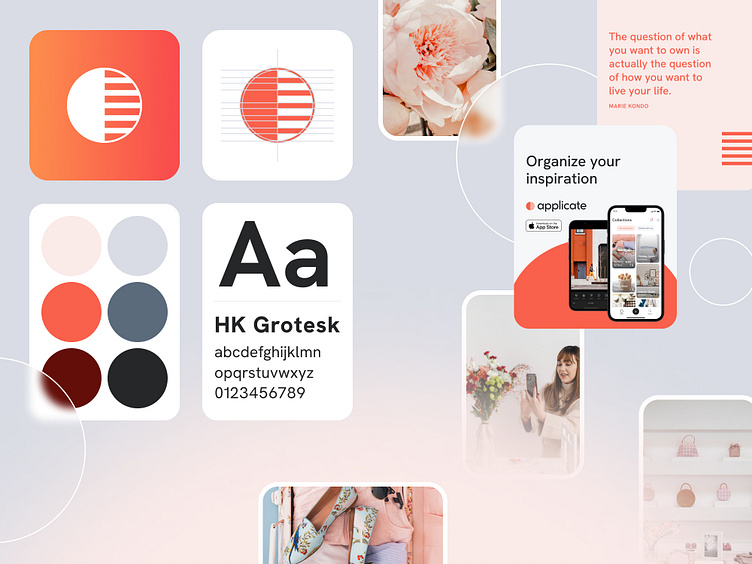
The brand stands on the idea of contrast, on the dichotomy between chaos and order, light versus dark. The circle, divided into two equal parts, represents these two universes.
On the one hand, the one where the content that may interest us in the near future resides raw, just waiting for our eyes to catch it. On the other, the world where, once this content is selected, we are going to store and categorize it to make our days easier and more productive.
Two fonts in harmonious balance
To build the logotype, we used Cocomat Pro in its medium weight. Cocomat is a typography designed by Francesco Canovaro and Devora Manetti as a development of the Coco Gothic typeface system created by Cosimo Lorenzo Pancini.
For corporate communication, like the marketing site or the app, we selected HK Grotesk, an open-source sans serif typeface inspired by classic grotesques. Geometry, metrics, punctuation and OpenType features have been updated to support a wide range of projects such as Environmental Signage, text face for books and magazines, and a wide range of interfaces and websites.
About Z1
We are a team of creatives and makers passionate about working with founding teams on early-stage product ideas.
Drop us a line at hola@z1.digital and tell us about your idea; we will make it a reality together. This is how 👉 Z1 Playbook.


