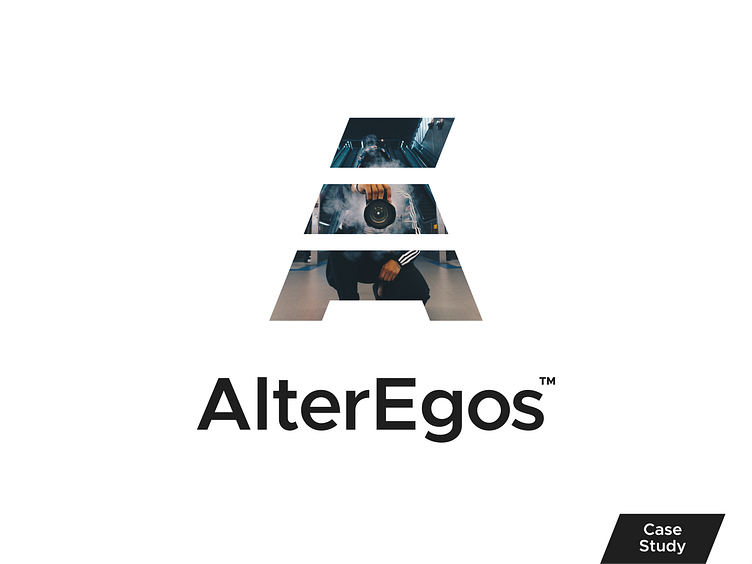
Alter Egos Case Study

Project Outline
The client was trying to create something that he could place on multiple business ventures that would stick out to people and be memorable. The identity needs to be simple and not too busy. It can be only black and white colors.
The client also mentioned other photographers typically use a shutter icon and he was trying to stay away from that. The logo might need to have a sense of classic, clean, friendly, and meaningful.
Sketches and Logo Ideation
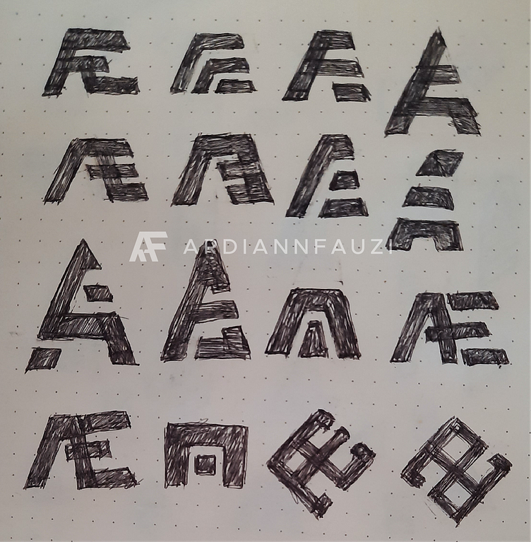
A pen and a piece of paper always become the best tools to find out where creativity might go to. As the client asked that the logo might be the best in the form of a pictorial mark or something like the two letters blending into each other, I started to sketch any possibility that has two letters (A and E representing the brand name of Alter and Egos) and made sure that the logo still has the look of a pictorial mark.
From the sketches below there were 3 logo options that could become the best candidates, although I was already sure that the best logo would be the one that has finally been chosen by the client.
Logo Options
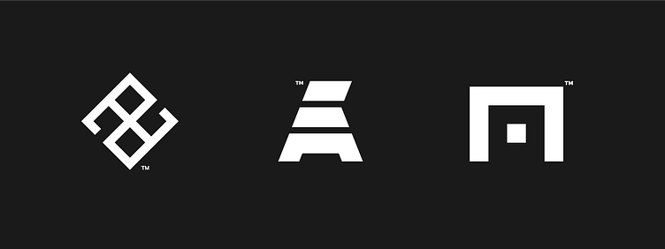
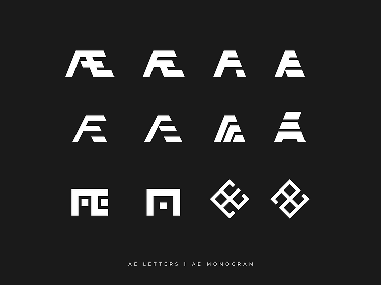
Concept 01 - The first concept tries to use the lowercase letters a and e as the monogram logo. The monogram also shapes several windows or doors to give some meaning to several businesses or services to provide or offer. The mark also feels between modern and classic, which is thought to fit as t-shirt screen printing or embroidery, a photography watermark, and the sign of a barbershop.
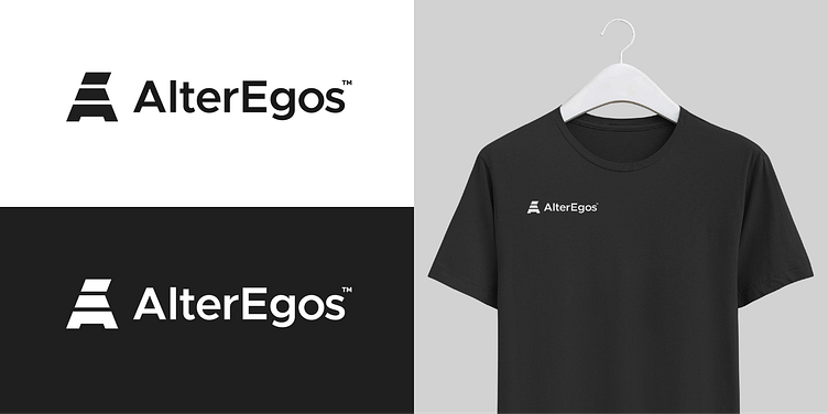
Concept 02 - The second concept approach is to incorporate the letter A and E. The idea is to make the situation of “when the audience sees it at first they will see an A, however, after some seconds they will realize it has some E on it. This logo also feels to have a kind of flag at the top as an identity to unite several businesses.
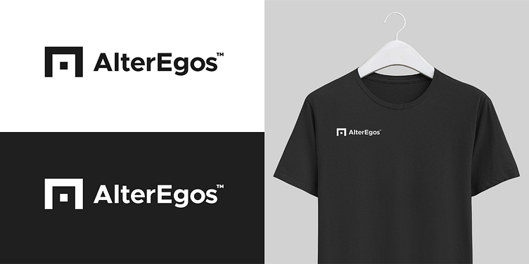
Concept 03 - A shape of a store, door, and gate inspires the third concept. This is where the customers open and come whenever they want the service. That is also the time when the customer is greeted warmly, such a welcome. As the Alter Egos will have several products and services to offer, this thought fits. Meanwhile, the door itself is also formed by the shape of A (a little bit abstract) and E (when rotated 90 degrees). In this way, it also represents the name of AE (Alter Egos)
----------------------------------------------------------------------------------------------------
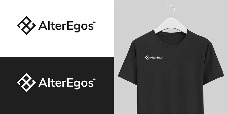
Final Logo
----------------------------------------------------------------------------------------------------
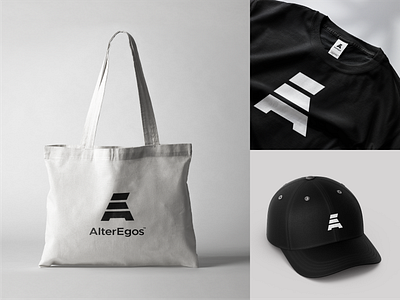
Brand Applications
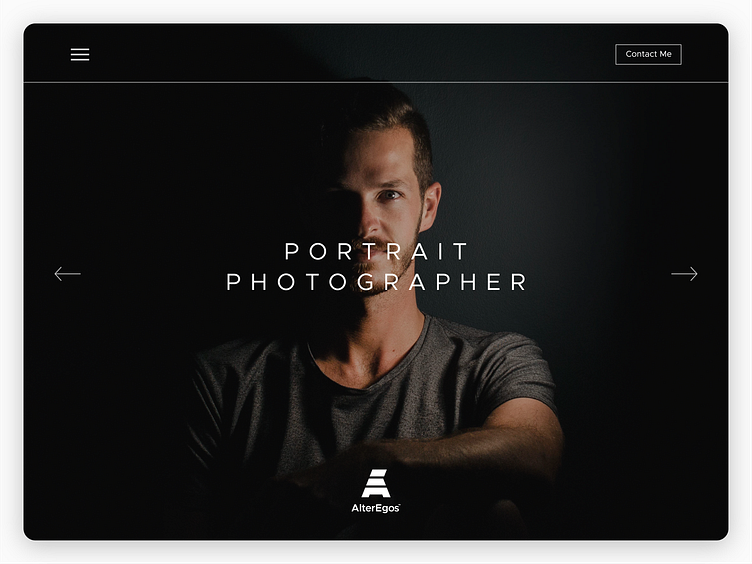
Photography Portfolio Website
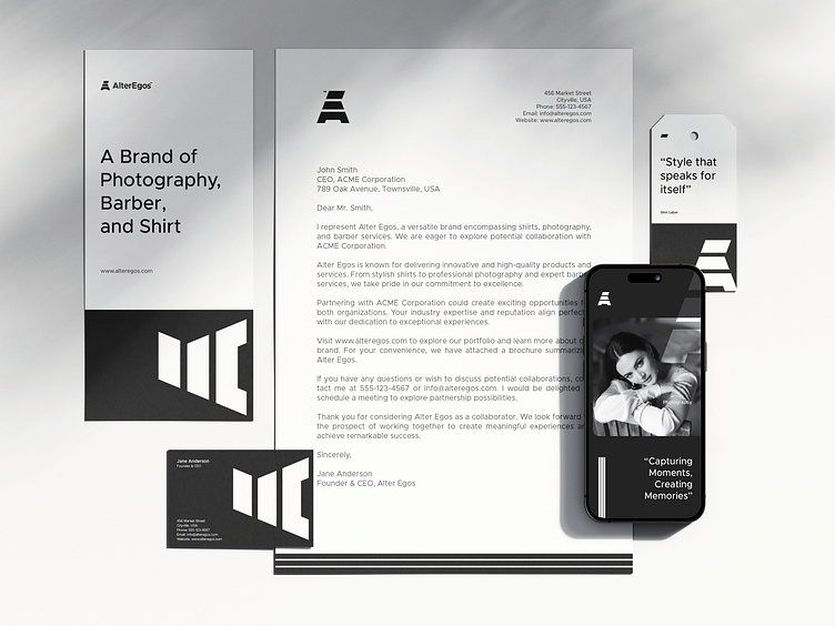
Stationery
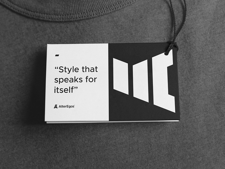
Clothes Tag
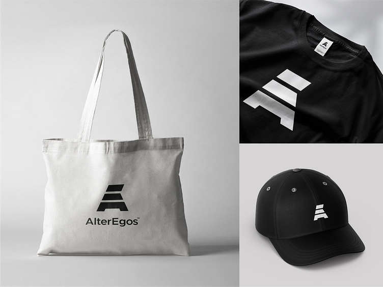
Apparels
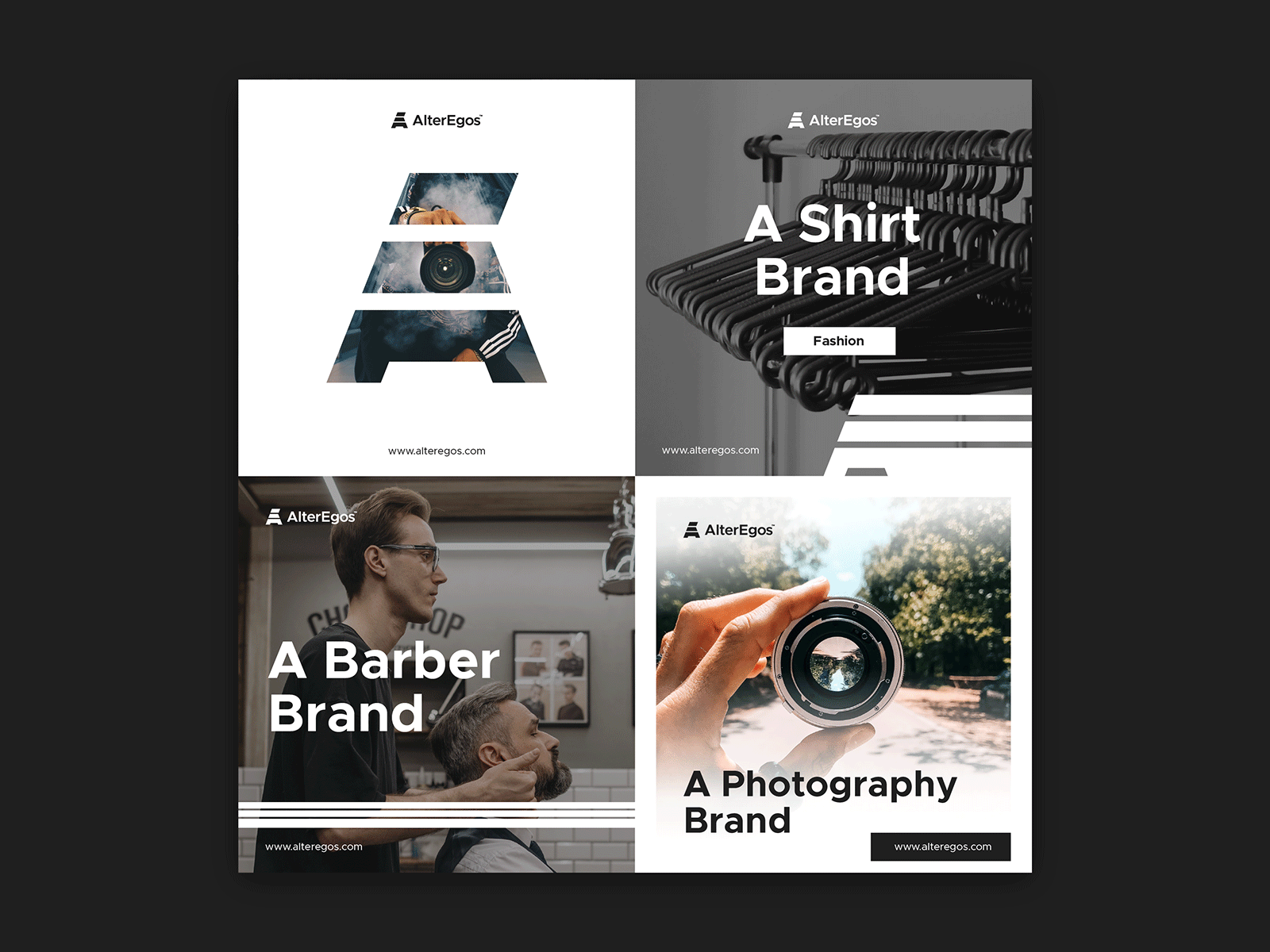
Social Media Templates
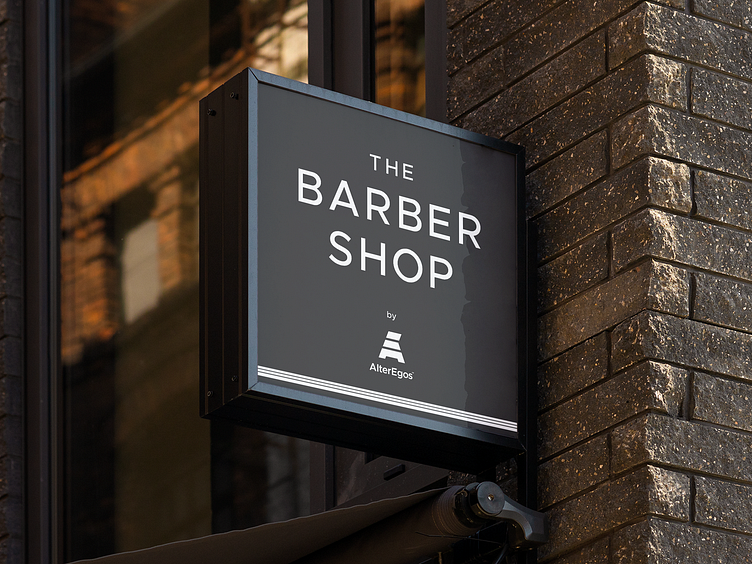
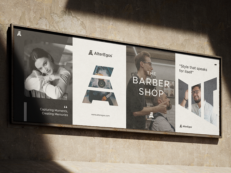
Outdoor Signage, Posters, and Billboards
End of Presentation
Thank you for watching this case study. This is based on a real project (a Logo and Brand Work). So, all concept designs belong to Alter Egos as the client. I would like to hear from you guys, all designers about the things I might be able to improve for the next project I have.
---
Alter Egos is a brand for multiple projects (Photography, Barber, Shirt Design)
---
Always available for freelance work.
Please contact me at ardiannf.nideli@gmail.com or use the "Hire Me" button on my profile to work with me.
---
Follow my Instagram ardiannfauzi