Calendar App: Commenting

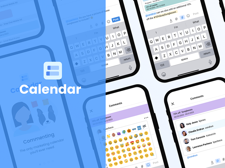
Commenting! is a feature built into our Calendar web and ios mobile app to help marketing teams increase productivity and collaboration.
Web and Mobile Experience
Both experiences were designed and built at the same time.
Project Info:
Project time frame: Approximately 2 months (for designs: that includes web and mobile) being built at the same time plus additional time for development, testing, etc.
My role: Lead Designer (Responsible for end-end design from conception to testing & launch).
The rest of the team: Myself, 2 Product Managers, 3 Engineers (front-end web, back-end web, and a mobile developer). I also collaborated with another product designer.
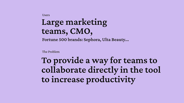
Step 1: Define - Users and Problem
In the define stage with defined the problem we were trying to solve and our target users.
Project Info:
Project time frame: Approximately 2 months (for designs: that includes web and mobile) being built at the same time plus additional time for development, testing, etc.
My role: Lead Designer (Responsible for end-end design from conception to testing & launch).
The rest of the team: Myself, 2 Product Managers, 3 Engineers (front-end web, back-end web, and a mobile developer). I also collaborated with another product designer.
Step 2: Market Research
The first step I took was to compile market research to find existing companies that offer a similar service.
I compared other messaging platforms, such as Google Teams, Slack, and similar SaaS tools that offered messaging in their product, such as Monday.com, Wrike, and Marketplace.io
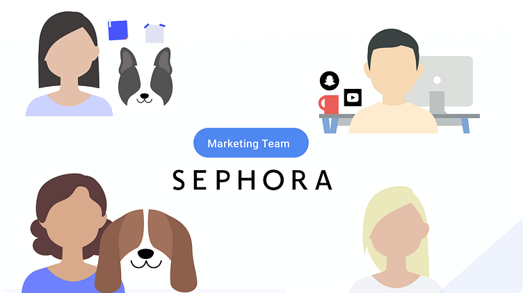
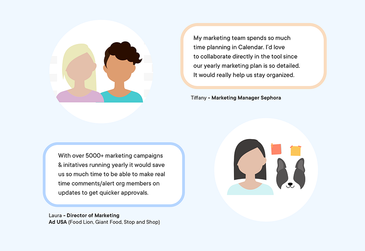
Step 1.1: Qualitative Research: Interviewing clients
Next, our team interview interviewed several users of our tool. There had already been a demand for this feature but we wanted to speak with some of the biggest users of our tool to make sure this would be beneficial to them. Here are two examples from Sephora and Ad USA.
Step 2: Feature Prioritization
From there I collaborated with our Product Manager on user stories and functionality.
In order to meet our initial MVP for development, these were the 5 user flows we prioritized:
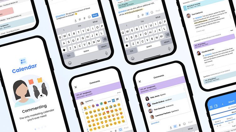
1. Creating a Comment: Consistenting of the user flow (entry point to endpoint) of how a user creates a comment.
2. Commenting and Tagging a User or a Campaign: (This is a sub-flow of 'Creating a Comment').
Users will also be able to @tag users, #campaigns and add emojis with additional formatting capabilities.
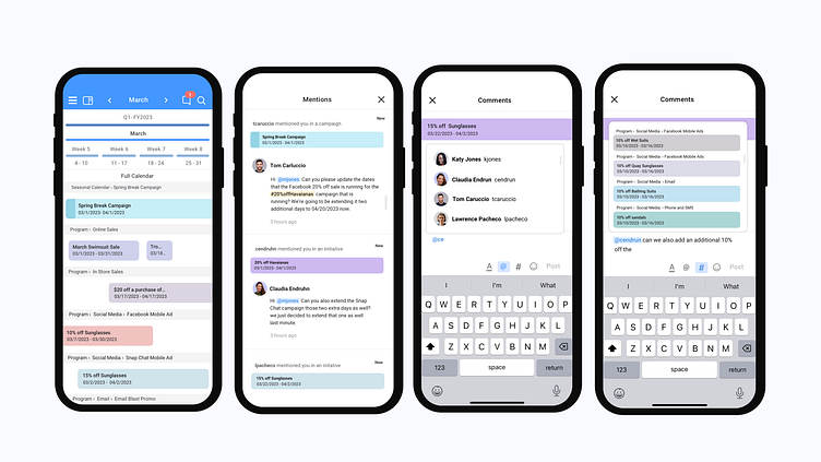
3. Mentions Feed: This flow is a sub-flow of 'Creating a Comment'. Users will be able to access and view all of their mentions in one place.
4. Editing & Pinning and Deleting a Comment: Users will be able to pin and edit, delete comments
5. Alerts (The ability to turn on or off. So the user can receive a push notification or email when they have been mentioned in a new comment).
Next, I created user flows for all the flows mentioned above.
Step 3: Wireframes -
These are just two of the flows the project had many more.
Flow 1: Creating a Comment Flow
Flow 2: Commenting and Tagging a User
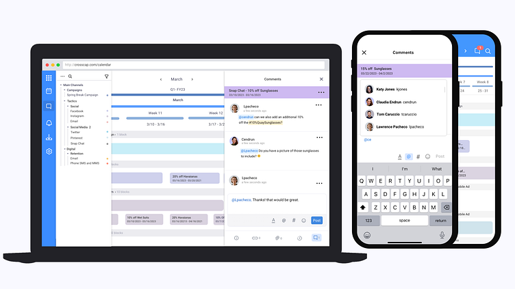
Below are the screens that we're designed to get through the flow of 'Commenting and Tagging a User (This includes @user, #campaign, and adding emojis)

Step 4: Iterations
Edit Comment Flow
Here are some design iterations we went through when figuring out the best way to edit a comment.
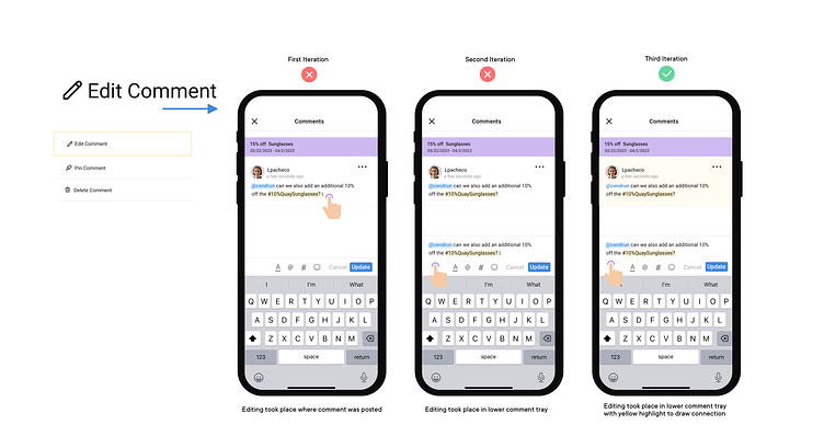
First Iteration: Editing a comment in the area where it's posted. Some feedback was it looked disconnected from the comment tray.
Second Iteration: We tested editing a comment back in the commenting tray, while this approach was closer something was still off
third Iteration: We keep editing in the commenting tray but added in
a yellow highlight to connect the user to the area they are editing.
4. Design system
During my time at CrossCap, we were actively building out our design system
5. More testing and Refinements
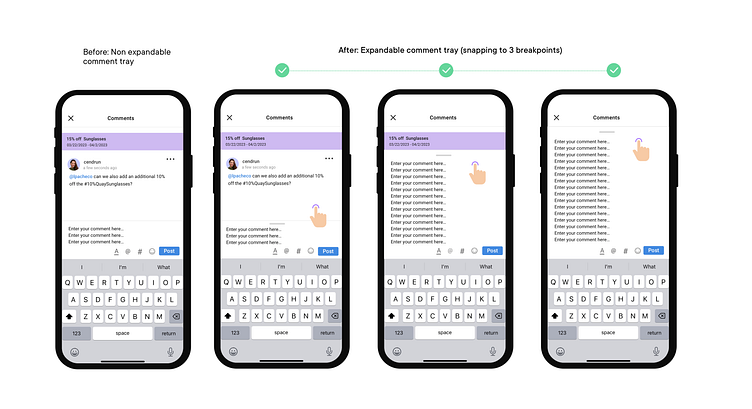
After additional testing we received some feedback from our client Sephora They mentioned that they need much more space on mobile when copying and pasting campaign briefs and that having such a small window to review and edit seemed frustrating.
#1 before:
After 8 lines of text, the text tray would scroll. (which doesn't leave much room)
#2 After:
We added an expandable comment tray with 3 break points so the user can control how much space they need. We retested it on Sephora and a few of our clients, and they loved it.
6. Final Design
These are only a few of the screens - Please watch the prototype below to view more.
6. Prototype
Reflection
I learned a lot about the urgency of communication in marketing departments and how much goes into planning yearly campaigns.
More testing and features can be added in the future. I wanted to add live editing among several users at once. We didn't have time for that in V1. We will keep getting feedback to guide us in the right direction to prioritize the next features.