Hermeus | Brand Identity

Hermeus | Brand Identity
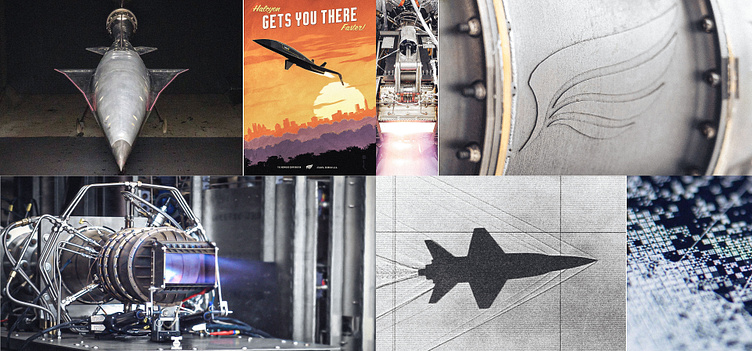
Hermeus was founded in 2018 with the mission to radically accelerate air travel by developing Mach 5 aircraft to connect people faster and bring innovation to commercial flight.
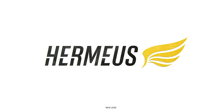
In collaboration with Martin Berman and Hermeus’ leadership team, I had the opportunity to refresh their brand identity, create the sub-brand identities for the three aircraft in their fleet, and develop a custom typeface for use across all brand touchpoints.
This first collection here is a showcase of the refreshed wordmark, strategy, and process that guided the subsequent sub-brand aircraft identities.
Credits
Marty Berman | Hermeus CMO
Jeremy Nelson | Project CD & Designer
Links
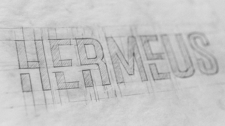
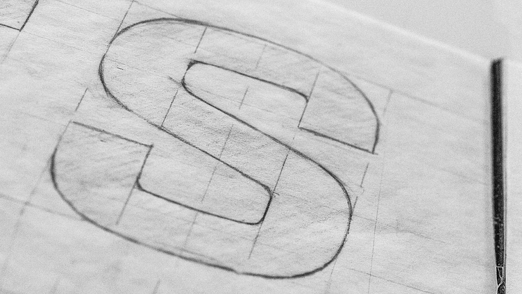
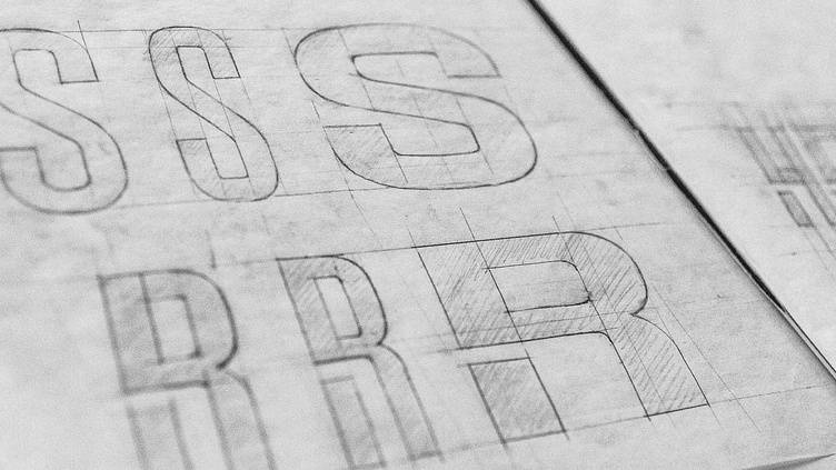
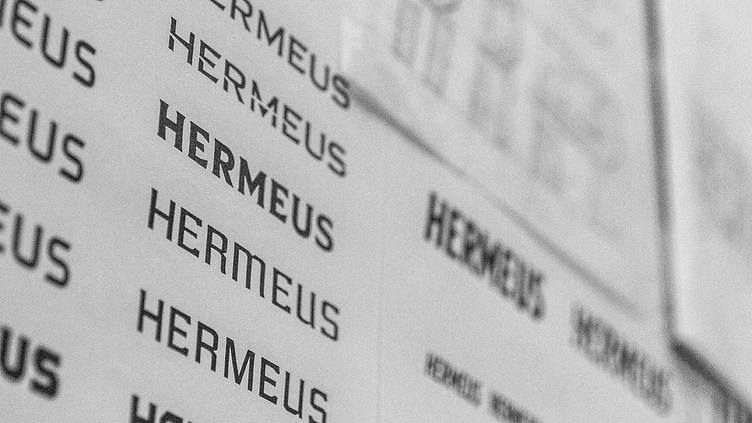
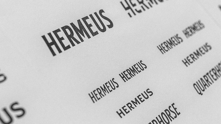
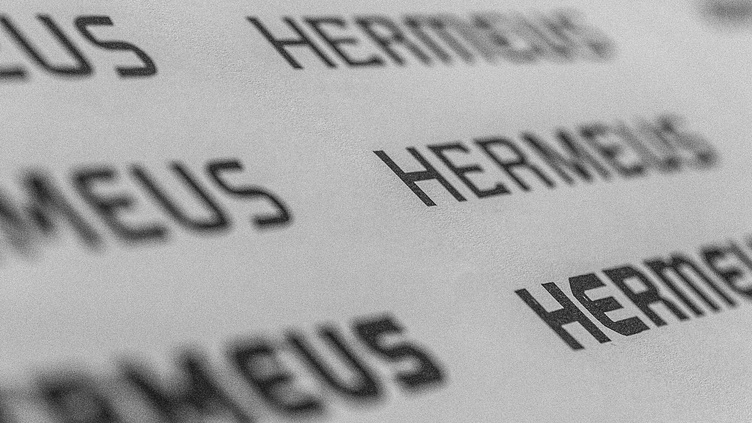
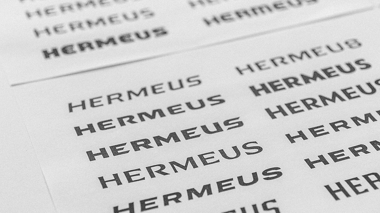
Engineering an Identity
With the original identity as a foundation, my challenge was to revamp the existing system and introduce secondary aircraft-specific sub-brands while preserving the Hermeus’ wing as the brand's capstone element.

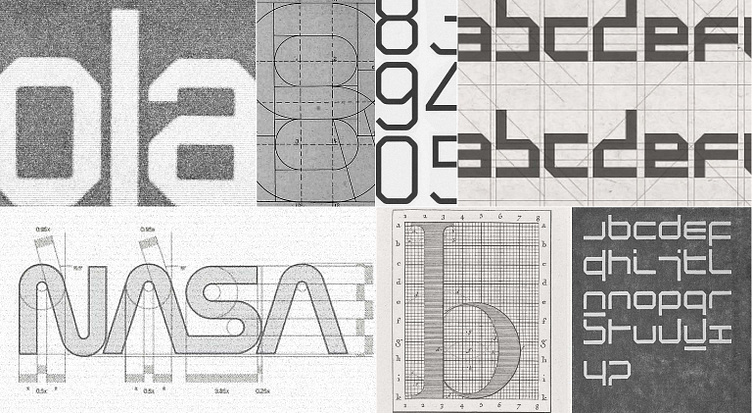
Taking cues from the scientific nature of the aerospace industry and constructed type styles, we settled on an approach for Hermeus’ new type system that levereged simple geometric shapes, mathmatical constrained curves, and a restrained approch to optical compensations.

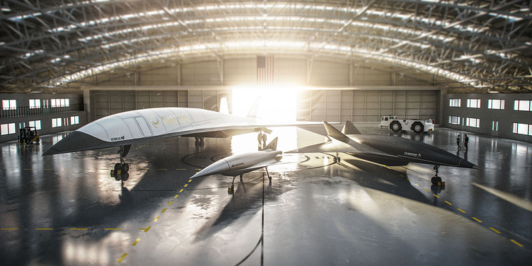
Hermeus' fleet of Quarterhorse (center), Darkhorse (right), and Halcyon (left)