Risk Management - Webtool


Hello Everyone 🙋🏻♀️
I am so glad to share design process of a risk management tool, I designed for Pasquil BV based in Utrecht, NL.
The tool will be used by several organisations at the same time to better the risk analysis process. Each organisation will have an overview of the risks and the mitigations.
Scroll down for full case study ↴
RA Tools
A risk management tool that allow the uncertainty to be addressed by identifying and generating metrics, parameterizing, prioritizing, and developing responses, and tracking risks.
TEAM
Divya Kothari and Zeynep Gucluko
DURATION
3 months
Role
UX Researcher, UI/UX Designer
Tools
Figma, Google Suite (Meet, Docs, Sheets etc)
Goals and Challenges
The client had a simple request - Make RATools way cooler than Microsoft Excel. And a challenge is always brings a motivation, so the fun begins...
So first we started analysing every nook and cranny of the competition, the market and we did find the areas for growth and improvement.
The goal was clear, to create a fresh design to hold data and related risks.
We had one problem though; Organisations are used to of using excel for risk management tasks. Regardless of our ability to build the best risk management system, the underlying reactionary trait of the human being would be hard to counter.This is due to reminiscing technological illiteracy and being in the comfort zone.
With this came a real challenge; we had to strike the perfect balance between usability, recognisability, freshness with ease and comfort.
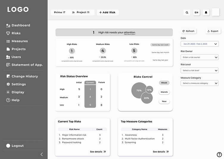
Dashboard
(Prototype)
We didn't want the screen to resemble a cluttered desktop piled high with irrelevant information and unattended orders. In other words, we created a contextual POS that adapts to the status of the service.
We carefully grouped all the informations. This made it easier for the organisation staff to focus on a specific data without feeling like they were drowning in chaos.
Usability testing

To create a usability test script to give an explanation for the test and what is required from the user and the consent of agreement to the recording of session for research purpose
Whilst note-taking the information/feedback from the selected users, the most common referred detail the user had pointed out was;
" Adding a new risk is important and must be quick and easy, where can I find the button?”
“How difficult risk addition will be?”
"What about the status of the risk? Can I see whether the measure has been taken or not?
" I would like to be alarmed by high risk arrival."
" Risks must be visible monthly, weekly and yearly manner. Moreover customisation of dates must be given.”
" Selection of projects and organisation should be easy and quick”
These important informations were to understand what the user finds extremely important when it comes to using the tool at the selected organisation and project where the competitive might be lacking.
User Flow
This flow chart describes how the user takes steps to achieve the goals.

low fidelity prototype
Paper based hand drawn mock ups were made. These mockups gave us a direction in which we worked in depth later on.


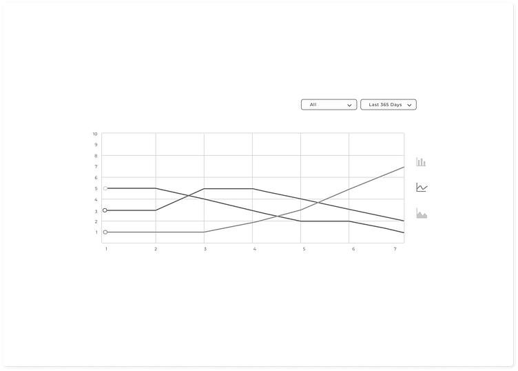
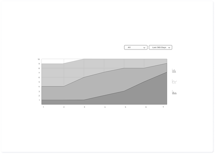
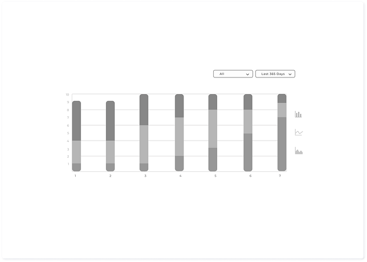
Risk Control Graphs
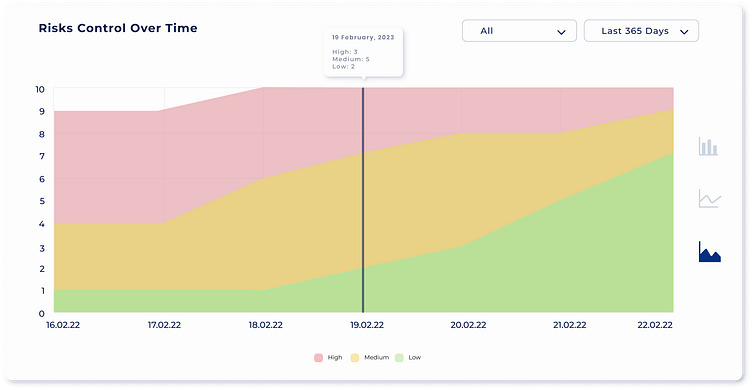
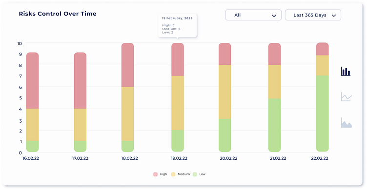

Risk control over the time is recorded and has a graphical representation. We have 3 types of graphs for it.
Add Risk
Add risk button covers every screen of the tool in top navigation bar. As adding risk is very important and it should be less time consuming.


Wireframes