@Hunter I think it's on the limit of subtleness, I see what you're saying but the whole app through-out is very very subtle and light, so I don't want to push it.
@Pete Good point man, I will check the spacing issues, thanks.
@Eric I actually had the same concern when I was putting the 1px stroke there, but it actually doesn't look that bad. One concern is though, scaling down for non-retina screen. iOS seem not to like odd pixels when scaling down, so we shall see. Thanks!
8 Responses
Pro
Kerem Suer
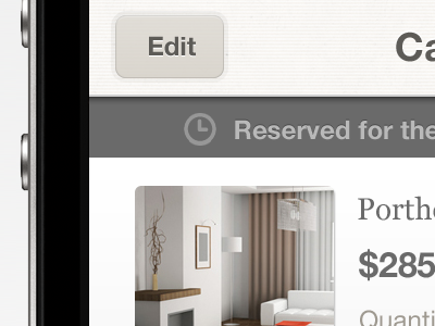
Trying to keep the minimal look and feel as much as possible. Check out the other shots in this project. Feedback appreciated as always.
almost 2 years ago
Pro
Hunter Hastings
Lookin' great. Only suggestion would be to make the lines in the top bar a bit darker so it shows up nicely on the retina display.
almost 2 years ago
I'm loving the subtle texture in that top bar
almost 2 years ago
Pro
Jack Bingham
I love the colour choices.
almost 2 years ago
give 'reserved..' copy a bit more love and make space above and below it equal. love the subtle glow border around the edit button
almost 2 years ago
Pro
Brent Jackson
Sorry, I can't help but like all these shots.
almost 2 years ago
Pro
Eric Hoffman
Love it Kerem! Is it intentional that you have a 1px stroke on your buttons? Because on the retina, that will barely show up.
almost 2 years ago
Pro
Kerem Suer
Thanks guys, appreciate the input.
@Hunter I think it's on the limit of subtleness, I see what you're saying but the whole app through-out is very very subtle and light, so I don't want to push it.
@Pete Good point man, I will check the spacing issues, thanks.
@Eric I actually had the same concern when I was putting the 1px stroke there, but it actually doesn't look that bad. One concern is though, scaling down for non-retina screen. iOS seem not to like odd pixels when scaling down, so we shall see. Thanks!
almost 2 years ago