Cornerstone icon redesign

Ccc

29 Responses (page 1 of 2)

  1. SoftFacade SoftFacade

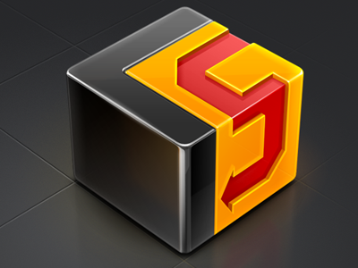
    We've recently completed a redesign of the Cornerstone 2 icon.

    Since hearing about Cornerstone, our UX design department have started using it exclusively. We're pretty sure that a great product must have a stunning app icon too.

    www.zennaware.com

    almost 2 years ago

  2. Oliver Twardowski Oliver Twardowski

    Great work, guys!

    almost 2 years ago

  3. David Im David Im

    damn~!

    almost 2 years ago

  4. Michaël Betsch Michaël Betsch

    I was going to say that you are jackasses for redesigning a good icon without asking the company first… But since I see it's now the official new icon, I can only say that it's some impressive work. The textures and depth of the cube are brilliant.

    almost 2 years ago

  5. SoftFacade SoftFacade

    This is the official one.

    likes

    almost 2 years ago

  6. Syahmi Ismail Syahmi Ismail

    stellar work! looks delicious tho :)

    almost 2 years ago

  7. Luke Ritchie Luke Ritchie

    superb! Is that a CSS icon by any chance?

    almost 2 years ago

  8. Vladimir Kudinov Vladimir Kudinov

    Nice!

    almost 2 years ago

  9. Max Fellmuth Max Fellmuth

    I hate you

    likes

    almost 2 years ago

  10. Josh Laincz Josh Laincz

    I want one. For real. To hold. And keep in my pocket to show people at a later date.

    almost 2 years ago

  11. Chris Wallace! Chris Wallace!

    Nice icon. We use Versions at Lift and love it - though we're slowly migrating over to Github now that it has an official Mac app.

    almost 2 years ago

  12. Andrew Lucas Andrew Lucas

    The paving slabs look amazing, they're the first thing that caught my eye!

    almost 2 years ago

  13. Oykun Oykun

    not much to say; an another amazing SoftFacade work!

    almost 2 years ago

  14. Matthieu Dufour Matthieu Dufour

    the reflection on the floor is sooo yummy!

    likes

    almost 2 years ago

  15. Anna Paschenko Anna Paschenko

    wow :)

    almost 2 years ago

  16. Louie Mantia Louie Mantia

    Looks great, I use Cornerstone all the time! I only wish the Red was as vibrant as the old one. :)

    almost 2 years ago

  17. Pranav Pranav

    @mantia Seems it is desaturated only here, the icon on the website has a really vibrant red.

    almost 2 years ago

  18. Louie Mantia Louie Mantia

    It seems so! The whole icon looks more saturated on the site.

    almost 2 years ago

  19. Stefan Stefan

    And this is done with ... ?

    almost 2 years ago

  20. Luke Ritchie Luke Ritchie

    It must be rendered with CSS on the site...SoftFacade? is it?

    almost 2 years ago

  21. Mikael Eidenberg Mikael Eidenberg

    Love the subtle translucensy on the yellow part. The icon looks great on the site, really poppin!

    almost 2 years ago

  22. Ilia Parshukov Ilia Parshukov

    Perfect!

    almost 2 years ago

  23. Fabio Benedetti Fabio Benedetti

    Great icon.

    almost 2 years ago

  24. Astrit Malsija Astrit Malsija

    Niiice work :D damn i love it.

    almost 2 years ago

  25. Tristan McNatt Tristan McNatt

    freaking gorgeous

    almost 2 years ago

keyboard shortcuts: previous shot next shot L or F like